8 Tips to Create Minimalist Email Design
Minimalist email design with clean fonts and a nice layout can really catch attention and leave a lasting impression on subscribers.

In today's digital world, we're bombarded with tons of info every day, especially with everyone having smartphones. As an email marketer, standing out is crucial. Minimalist email design with clean fonts and a nice layout can really catch attention and leave a lasting impression on subscribers.
Also, more than half of emails are now opened on mobile devices. That means you need emails that are easy to read and load quickly. Nobody wants to deal with long, complicated, or broken emails while on the move. Keep it simple and snappy.
In this article, you’ll learn everything about minimalist email design. So, let’s explore together.
What is Minimalist Email Design?
Minimalist email design is all about keeping things simple and easy to grasp. It's like the 'less is more' approach for emails, using basic HTML elements and avoiding too many fancy effects.
These designs offer clarity and elegance, making it easier for people to focus on what matters most. Thus, clean layouts and simple visuals ensure faster loading times, better readability, and increased engagement, ultimately leading to higher click-through rates and conversions.
Simplistic email designs are sleek and streamlined, but that doesn’t mean they have to be boring. You don’t have to go back to plain text emails with a single hyperlink. There’s room for you to be creative while keeping it simpler.
After all, who wants boring emails? They're like modern-day letters – personal and direct. So, let’s give them a touch of style to ensure they’re as appealing as they are meaningful.
Tips for Creating Minimalist Email Designs
Marketing experts love minimalist email designs because they make your message clear, beautiful, and attractive. Your audience gets the message quickly and feels inspired to act. To create these clean and powerful emails, here are some top tips to remember.
1- Use negative space wisely
White space in emails isn't blank at all. It's like the breathing room for your content, making it easier to read. In minimalist emails, it's the secret sauce that balances everything out!
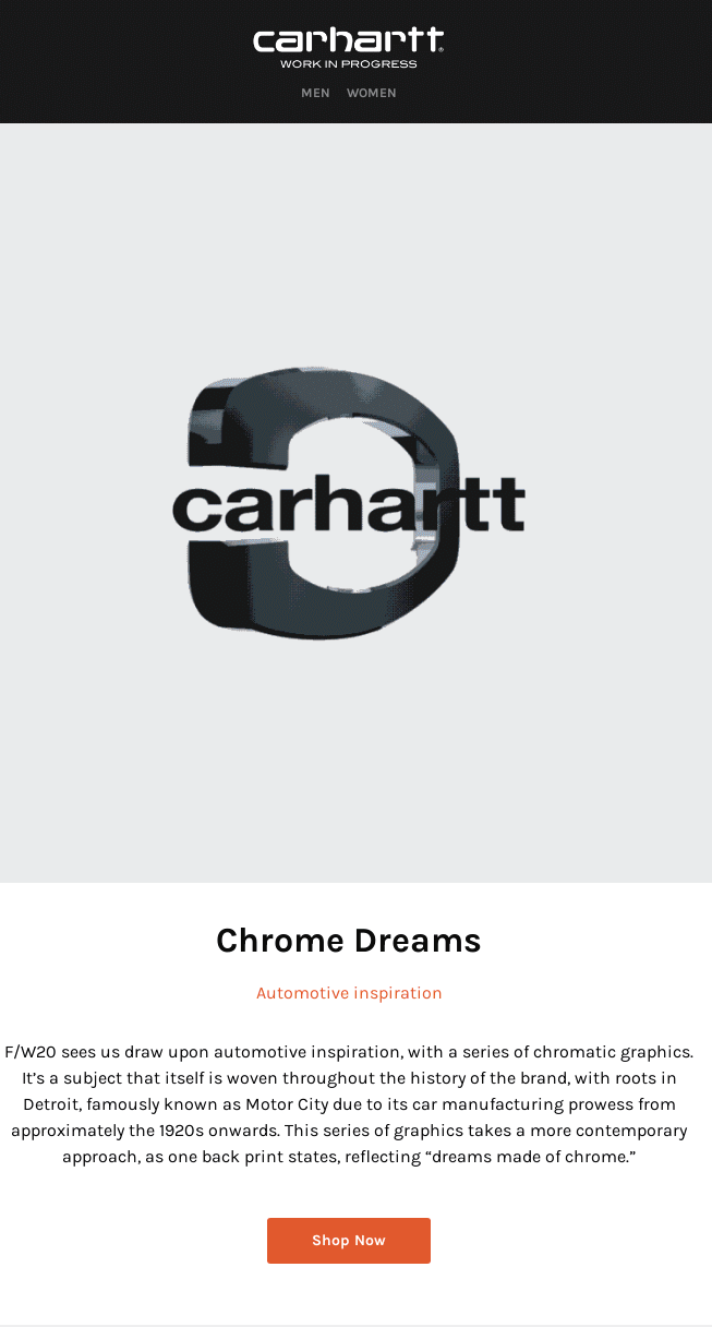
Carhartt's latest clothing line takes inspiration from automotive aesthetics, adding a fresh twist to their collection. Their email cleverly uses the white space around the main image to grab attention and emphasize the concept.
2- Use appropriate colors
Monochrome colors give a sleek vibe that matches the minimalist style. But hey, if your brand rocks bright colors, go for it! Just keep it balanced. Use colors wisely to highlight what really matters in your message.
Here's an example to nail a monochrome look in your campaign: match the background, photo, and fonts all in the same color scheme.
3- Build visual hierarchy
In emails, simplicity is key. A minimalist design works wonders if it's well-structured. Arrange the elements in a way that immediately grabs the subscriber's attention. Whether it's tech giants or fashion brands, many are embracing minimalist email designs.
In the example above, different sizes and types of fonts affect our attention span and encourage us to immediately click the call-to-action button.
4- Limit the use of graphics
Though graphics can be useful for catching subscribers' attention, it's important not to go overboard with them. By using visuals strategically, you direct the reader's attention where you want it. For instance, highlighting the product image ensures subscribers stay focused. This idea lies at the heart of minimalist design.
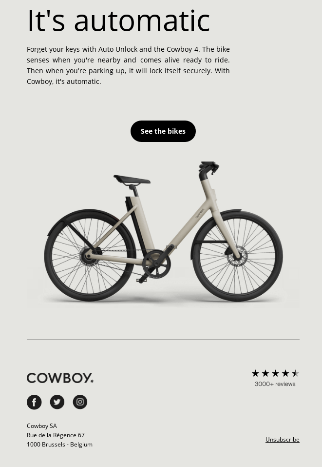
No other images stand a chance of distracting consumers from the main point of the newsletter: the new bike.
5- Use clean typography
Mixing different fonts with various styles and sizes can be challenging. A Good email design promotes clean typography, which keeps a template looking neat and attractive. Stick to fonts that match your brand identity for your campaigns. Also, ensure that the chosen fonts display correctly on different devices.
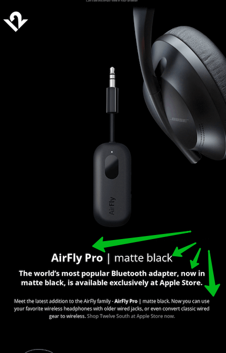
In AirFly's email template, they use multiple fonts, but they're all aligned and maintain a minimalist look.
6- Keep it short!
Respect your subscribers' time by getting to the point quickly. Aim to write concise emails that eliminate unnecessary words. Your message should be as brief as necessary to convey its meaning.
This email introduces the new collection and encourages you to visit the website for more purchases. That's why the wording here is kept minimal.
7- Don’t forget the header and footer
In your minimalist email design, remember to include a header and footer—they're like the icing on the cake! Adding these touches not only adds a dash of style but also keeps your emails polished and professional, making sure your brand shines through while providing key info.
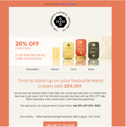
This email header example stands out because it brilliantly captures the main message: the flash sale. It grabs your attention right away and lets you know what the email is all about.
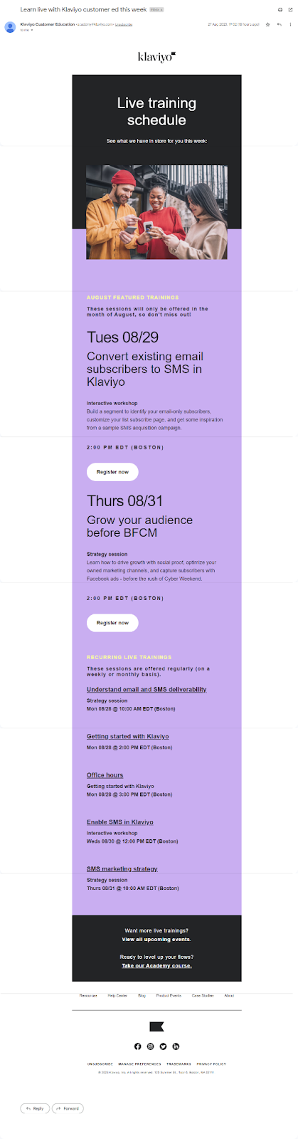
Klaviyo's email nails it with its well-crafted footer. Despite the clean layout, it packs in all the vital info you need, including unsubscribe and preference change links. It's a neat and efficient way to wrap up the email experience.
8- Keep your design responsive
Your email shouldn't only look good on computers; it needs to work well on mobile devices, too. Make sure your design appears nicely on smaller screens; your CTA buttons are big enough to tap, and keep the vertical scroll to a minimum.
5 Examples of Minimalist Email Designs
Check out these examples of minimalist email designs below.
1- Baggu
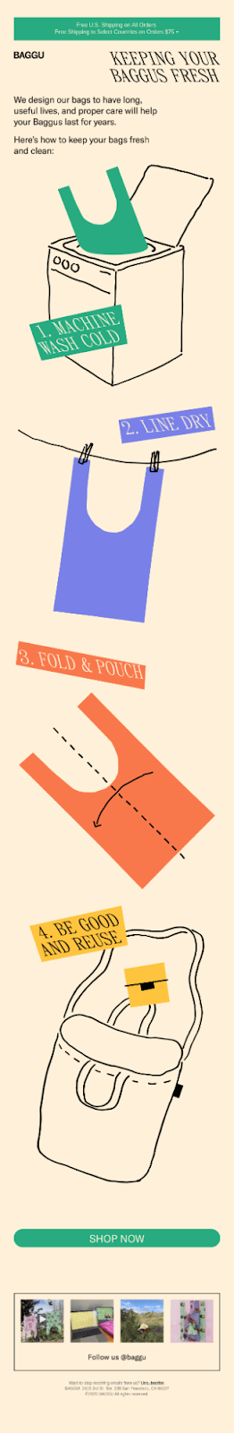
If you thought minimalism couldn't include animation, think again! In this email, animation takes center stage and brings it to life. The simple font, along with the soft background, creates a delightful viewing experience. Whoever thinks tutorial emails can't be minimalist should take notes from Baggu—they're proving them wrong.
2- Apple
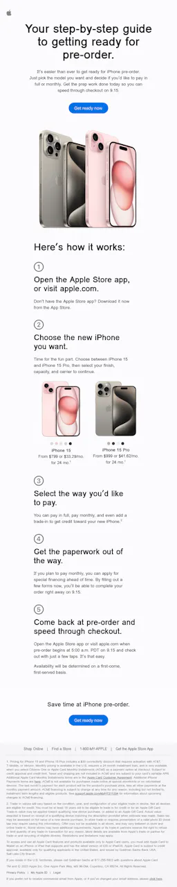
When we think of minimalist design, Apple often comes to mind first. In this sleek email from the brand, the simplistic background draws attention to the main image and offer. As you scroll, plenty of white space helps you focus on what matters most: the suggested products.
3- Lyft
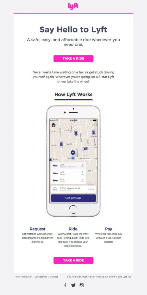
We love Lyft's emails! They use the same bright pink call-to-action (CTA) at the top and bottom, making it super easy to spot. Plus, they keep it simple when explaining 'how Lyft works' with just an image and some text, sticking to a minimalist style all the way.
4- Harry’s
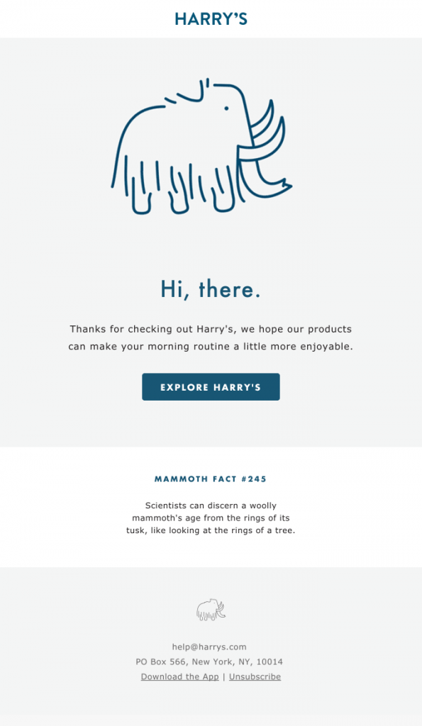
This welcome email from Harry's is minimalist, creative, and just fantastic! They use their favorite mammoth as the main image, keep the text short and sweet, and place the call-to-action (CTA) right where you need it. Plus, they throw in a cool mammoth fact to add fun to it.
5- Better
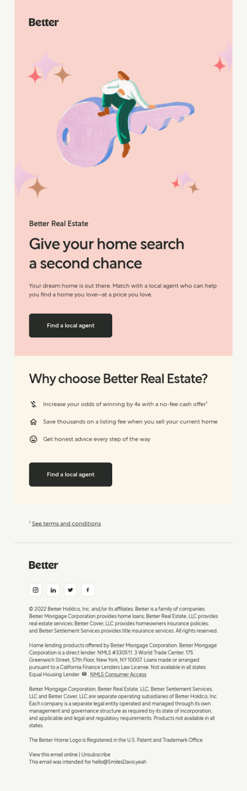
Better's email design is a minimalist masterpiece! It features clean typography, lots of white space, and soothing colors. And that illustration in the hero section? Stunning! Likewise, the CTAs stand out boldly against the background, making them impossible to miss.
How to Implement Minimalist Design in Your Email Campaigns
Implementing minimalist design in your email campaigns is easier than you think. All you need to do is:
- Simplify your email layout. Use clean lines, ample whitespace, and minimal elements. Moreover, limit the use of images and texts to what is essential for your message.
- Choose simple and easy-to-read fonts. To maintain consistency, use one or two font styles throughout the email.
- Use colors strategically to draw attention to main elements like CTAs or important information.
- Use short paragraphs or bullet points to improve readability and engagement.
- Optimize your emails for various devices, screen sizes, and email clients.
Opt for A/B testing to gauge the appearance and performance of your emails across gadgets and email clients.
Consider A/B Testing
Conduct A/B tests to compare various elements of your minimalist email design, including subject lines, visuals, and CTAs. Then, check metrics like open rates, click-through rates, and conversions to see which design works better.
Here’s how it works;
- Create two versions of your email campaign, with one element (such as the subject line) different between them.
- Then, send each version to a group of subscribers and compare the performance metrics.
- This helps you understand what your audience prefers so you can refine your email campaigns for optimal engagement and effectiveness.
Tips for measuring the effectiveness
Here’s how you can measure the effectiveness of your minimalist email campaigns.
- Keep an eye on metrics like click-through rates (CTR) and overall engagement. But go beyond just click rates to really grasp how your audience is responding to your content.
- Your email marketing aims to prompt a specific action (conversion rates), like signing up for a trial, scheduling a demo, or making a purchase. Tracking how many recipients actually take these actions after receiving your email gives you a clear measure of success.
- Measuring the return on investment (ROI) of your email campaigns by comparing the revenue earned to the campaign costs can justify investing resources in your email marketing strategy.
- Watching how your email list grows over time (growth rate) gives you a glimpse into how well your email campaign is doing. If your list keeps growing steadily, it means you're doing a good job capturing leads and keeping your audience engaged.
- By examining engagement patterns, like how long subscribers stick around and how they interact with your emails, you can uncover hints about the lasting value you offer your audience.
- Forward rate/share rate is often an underestimated metric, but believe us, it's a goldmine of insights that show how engaging and shareable your content is. When people forward or share your emails, it means they find them valuable, helping you reach more people naturally.
5 Templates for Minimalist Email Designs
We've included some of our most loved minimalist email templates to make your life easier. Feel free to tweak them however you want!
Template 1
What makes this email template great is its use of clean blocks to announce sales, coupled with eye-catching images showcasing the brand's collection. Plus, the prominent call-to-action encourages users to act swiftly.
Template 2
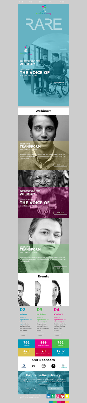
This email template stands out by using soft color palettes to inform subscribers about the speakers at an upcoming webinar. Despite being packed with information, its clever arrangement of blocks and info overlaid on images makes it truly exceptional.
Template 3
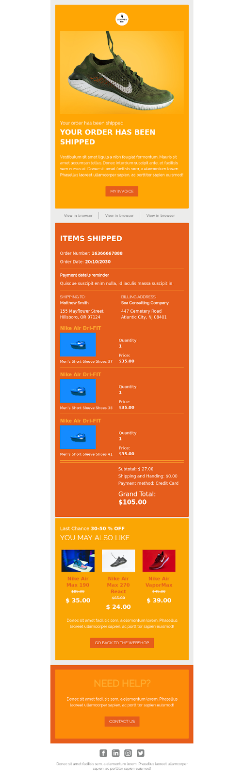
We designed this minimalist yet vibrant, contemporary transactional template specifically with athleisure webshops in mind.
Template 4
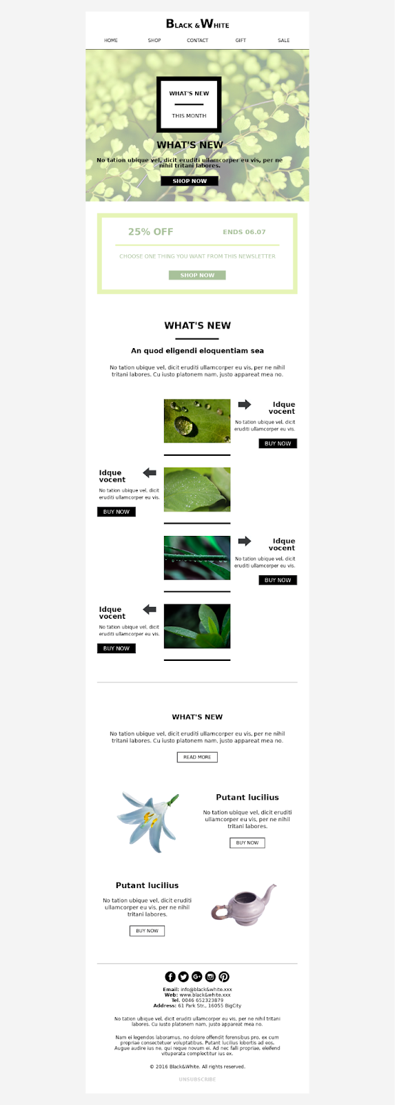
Elevate your spring promotions and sales of nature-related products or services with this simplistic email template. Customize it effortlessly by adding your products and call-to-action buttons.
Template 5
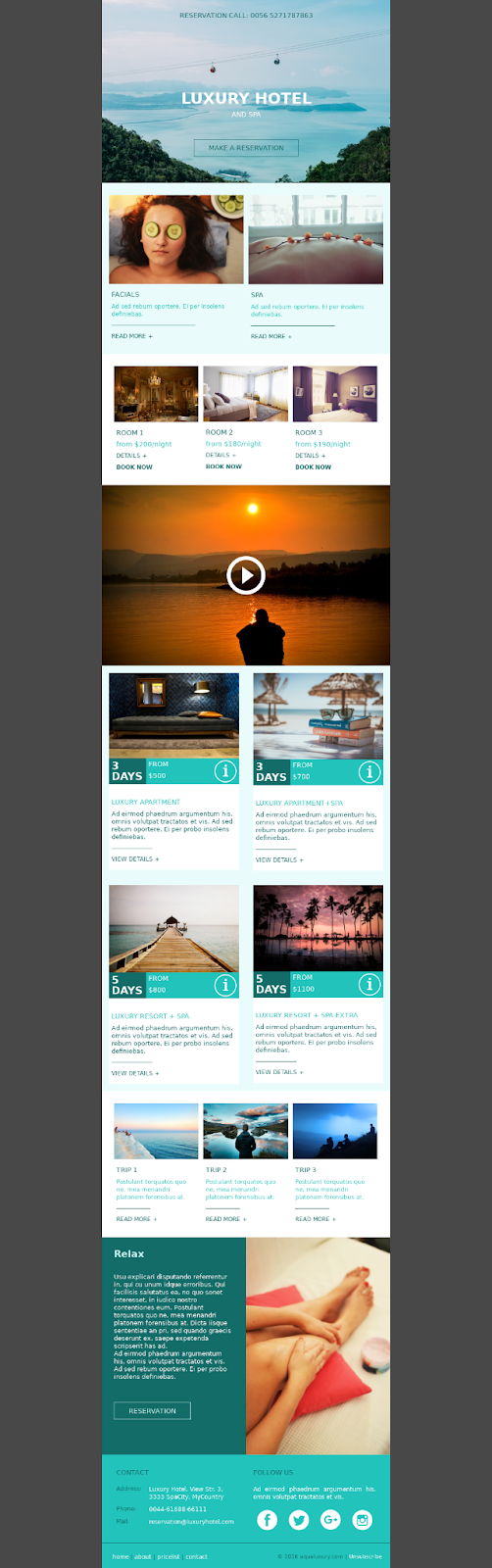
This versatile promotional template is ideal for hospitality, healthcare, or travel businesses. Reach out to your clients with offers using this fully mobile-friendly template. It features a showcase section where you can highlight your offers, videos, images, and price list. Additionally, in the footer, you can include your company information and social media links to attract more followers for your next campaigns.
Conclusion
To sum up, minimalist email design can really boost your marketing. Just keep it simple, use space wisely, and make sure it looks good on any device. With clear messages and easy-to-read layouts, you'll see better results in no time.
Got inspired and wanna see how your email will look in dark mode?
Frequently asked questions about email design challenges
How do I make an email template attractive?
You can make your email templates attractive by following the tips to craft minimalist email design. Focus on clean design, eye-catching visuals, concise copy, and a clear call-to-action. Or you can simply use Chamaileon to design awesome emails that actually convert.
How do I beautify my email?
You can beautify your emails by experimenting with different color schemes to add visual interest, incorporating subtle animations for engagement, dividing content sections using color blocks for clarity, and maintaining simplicity throughout. Likewise, ensure your design is instantly recognizable as yours. Thus, limit text to essential information and begin with strong branding elements. Plus, prioritize content hierarchy for easy reading and navigation.
How do I create a simple email template?
By following the simple tips outlined in the article, you can swiftly craft a minimalist email template that sets you apart from your competitors.
How do I customize my email design?
Begin by selecting a template or crafting your design. Then, infuse it with your brand's colors, logo, and fonts to ensure consistency with your brand identity. Include captivating visuals that speak to your audience. Arrange the layout to emphasize key details and ensure your call-to-action stands out. Lastly, test your design on various devices and email clients to ensure it displays correctly.