Responsive Email Design Tips for Tech Marketers
Responsive emails are super important for businesses. They make sure your emails look awesome on any device, whether it's a big computer screen or a tiny smartphone.

Responsive emails are super important for businesses. They make sure your emails look awesome on any device, whether it's a big computer screen or a tiny smartphone. This means more people can see your messages no matter where or what they use. With so many individuals using mobile phones for almost everything, it’s critical that your emails look great on every device. It ensures everyone gets the VIP treatment when they open your emails, no matter what gadget they're using.
Responsive emails not only look great on any device, but they also help businesses achieve their financial goals better. How? Good emails are spread across with CTA buttons, clickable text or social icons, and other clickable images. These click/touch points become so tiny if the email is not responsive, that clicking (tapping) them becomes a nightmare for the reader leading to conversion problems. So, responsive email design boosts conversions while making folks happier that they can tap. Therefore, with responsive email design tips, you can effortlessly craft emails that effortlessly adapt to the device and screen size of the subscriber. So, if you want your messages to shine, make sure they're responsive!
Therefore, with responsive email design tips, you can effortlessly craft emails that effortlessly adapt to the device and screen size of the subscriber. So, if you want your messages to shine, make sure they're responsive!
Benefits of Responsive Email Design
Responsive email design is like having a superpower for your emails. It's like a chameleon (hehe, Chamaileon), changing effortlessly to fit any screen size, especially on mobile devices. Thus making your emails a breeze to read and interact with, no matter where your customers are checking them. Therefore, when your emails are easy to engage with, you'll see more clicks, more conversions, and, ultimately, more sales rolling in.
Explore the detailed benefits of responsive email designs below.
Enhanced User Experience
The golden rule for email marketing is keeping your audience engaged, and responsive email designs make it easier for you. Such emails effortlessly adapt to any screen size, ensuring your subscribers have a smooth experience as they read your content, click links, and engage without a hitch.
Picture this: You receive an email on your phone from a brand you adore. If it's not responsive and looks weird, you'll probably feel annoyed trying to read or click on anything. Not cool! But with responsive design, everything fits just right, so you can easily enjoy the email and do what you need to do.
Improved Readability Across Devices
Responsive design for emails makes sure your messages appear good and are easy to read on any device, like a computer, phone, or tablet. Without it, your emails might look messy, distorted, or difficult to read on smaller screens.
Increased Engagement and Interaction
Responsive email design makes sure your emails look great on any device, boosting reader engagement. Marketing emails are meant for conversions. They want people to buy, sign up, or download. Responsive designs help you with this as they give readers a smooth experience thus driving greater engagement, interaction, and ultimately conversion. They ensure subscribers follow through with the actions you want them to take.
Higher Conversion Rates
When users enjoy a great email experience on any device, it almost becomes instinctive for them to take action. Also, when emails are flawlessly crafted, you can stop worrying about low conversion rates. A well-executed responsive design consistently boosts conversion rates, ensuring better results every time. Moreover, responsive emails achieve a 30% higher click rate compared to non-responsive ones.
Consistent Brand Experience
Consistency in branding is key to earning trust and being recognized by your audience. Responsive emails make it easy to keep your brand's look the same on all devices. By adjusting your email design for different screen sizes, you make sure your logo, colors, and fonts always show up right. This helps people remember your brand and feel connected to it, which leads to more engagement and sales.
Expanded Reach to Mobile Users
Daily, 75% of people use their smartphones to check their emails. So, it becomes crucial that your emails are optimized to fit small screen sizes. Likewise, over 50% of people unsubscribe from promotional emails if they don't open well on mobile. This means a non-responsive email could lose you half your business. However, with responsive design, you can boost click-through rates by over 30%.
Adaptability to Various Screen Sizes
You don't have to make different email templates for mobile, tablets, and desktops. With responsive email templates, the same emails look good on all devices without any hassle. This saves you time and effort, so you can concentrate on making your email subject line and content stand out.
Reduced Email Rendering Issues
Responsive email design uses flexible grids and special codes to make sure emails show up right on different gadgets and screen resolutions. These emails adapt to different devices by using fluid images, tables, and special codes to adjust the layout, text size, and call-to-action buttons. So no matter what device, operating system, or email client, responsive email always looks great and works smoothly.
Chamaileon responsive email design ensures they look perfect on every device and email client, making your job easier and your emails more effective.
Future-Proofing Your Email Marketing Strategy
Responsive email designs future-proof your email marketing strategy by ensuring that your emails look great and function well on any device, regardless of technological advancements or changes in user behavior. This flexibility helps you keep in touch with your audience, boost engagement, and stay ahead in the ever-evolving digital landscape.
Strategies for creating a responsive email design
Here’s how you can make different elements of your email responsive.
1-Increase font size for improved readability
Utilize media queries to adjust text size based on the device's screen size, ensuring a comfortable reading experience for users. While 14px text works well on desktops, smaller screens may strain readers' eyes, so opting for 16px is preferable for mobile devices.
Here's a simple code snippet you can use:
<style type="text/css">
@media only screen and (max-width: 480px){
.bodyContent{font-size:16px !important;}
}
</style>
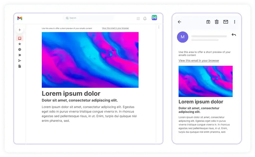
When the screen width is 480px or less, the text size will automatically get bigger for easier reading, like in the image below:
2-Make call-to-action buttons responsive
The email's main action buttons, or CTAs, should be both clickable and easily recognizable, especially on smaller screens. This benefits both you and the reader by enhancing usability.
For smaller screens, adjust the button's width, increase the text size, and switch the link to a block-level element for improved visibility.
<style type="text/css">
@media only screen and (max-width: 480px){
.emailButton{
max-width:600px !important;
width:100% !important;
}
.emailButton a{
display:block !important;
font-size:18px !important;
}
}
</style>
The above-mentioned code will result in a button that’s easier to click on and read, making it user-friendly.
3-Make fluid images
It's crucial to ensure all images adjust to the device or screen size, preventing horizontal scrolling caused by oversized images. To achieve this, make your images fluid so they can adapt seamlessly to various screen sizes and email clients. Here's a code snippet to help you make your images fluid and responsive.
<style type="text/css">
@media only screen and (max-width: 480px){
.emailImage{
height:auto !important;
max-width:600px !important;
width: 100% !important;
}
}
</style>
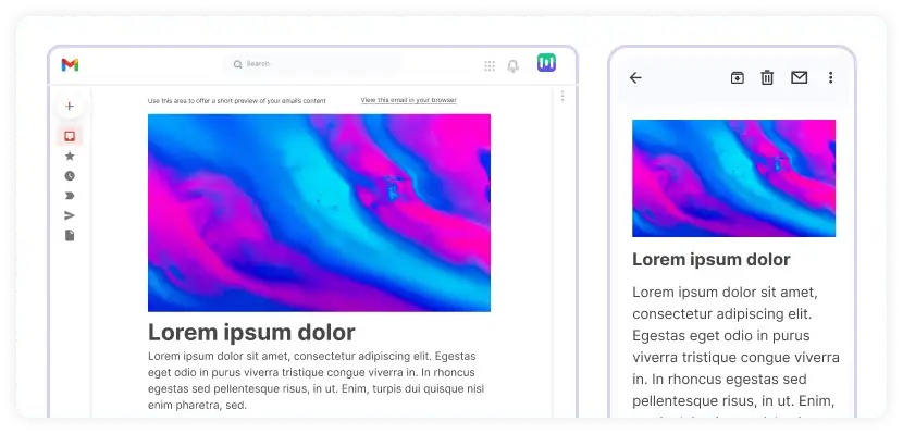
To prevent images from overriding on screens 480px or smaller, set a max-width equal to the image's original width. This ensures that when the media query activates, users see images that fit neatly on smaller displays, as illustrated below.
4-Use single-column layout
Opt for a single-column layout because it's easier to read on mobile devices and makes content appear less cluttered on smaller screens.
Consider using Chamaileon for seamless email design that's responsive without the hassle of coding and intricate responsive design details.
Responsive Email Design Examples
Here are a few examples of responsive email designs.
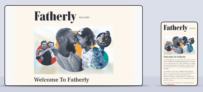
Fatherly
Fatherly helps dads raise great kids and shares awesome parenting advice. Check out their cool, responsive email example!
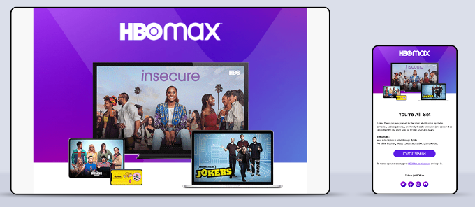
HBO Max
The email from HBO below is a great example of a design that looks good no matter what device you're using.
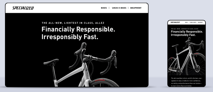
Specialized
They make wonderful bicycles for athletes and have even incredible responsive emails that adapt to any screen size.
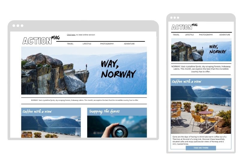
Action Magazine
See the example below from “Action Magazine”. It displays seamlessly on both desktop and mobile screens.
Concluding Thoughts
In conclusion, knowing how to design responsive emails is crucial for tech marketers who want to engage more people, boost sales, and keep their brand consistent on all devices. By using these tips and taking advantage of responsive design, marketers can make sure their emails connect with customers, prompt them to take action, and stay competitive in the ever-changing world of digital marketing.
Responsive email design system guide
Frequently asked questions about mobile-friendly email strategies
How do I make my email design responsive?
For responsive emails, opt for a single-column layout, fluid images, flexible text, and grids, and utilize specialized coding. Or streamline the process with Chamaileon for smooth responsive email design.
What is a responsive design in the context of email marketing?
Responsive email design ensures your emails look great and work smoothly on any device or email client by automatically adjusting their size. This means subscribers will always enjoy a seamless experience, no matter what they're using. Using media queries, responsive email design transforms fixed-width tables and images on desktops into fluid ones for smaller screens.
What is the basic principle of responsive design?
The core principle of responsive email design is that images are scaled using proportional units to fit the screen space available, maintaining quality and avoiding layout problems.
What is a responsive email format?
A responsive email is like a super-flexible newsletter that looks great, no matter if you're checking it on your phone, tablet, or computer.
How do you make a good responsive design?
To create a good responsive design, focus on fluid layouts, scalable images, and media queries to adapt to different screen sizes.