Email Dividers: How to Create Section Separators in HTML Email (With Examples)
Learn how to create email dividers that work across every email client. This guide covers five divider types, copy-paste HTML code examples (including gradient fallbacks for Outlook), design best practices, and real-world strategies for e-commerce, SaaS, editorial, and transactional emails.

~10 min read
When I created my first divider for email, it was a thin green line with 20px-20px padding on the sides to have that "floating" effect. I put it there to separate a product news section from a blog article recommendation list. Classy.
This was around 2014 and it surely bumped the design aesthetics for my very 2014-style email design. Then I learned more about email HTML, rendering problems, and using transparent dividers for nice layouts.
Now, we are in 2026 and I write about transition-gradients for ecommerce emails that connect two, individually colorful sections full of product images, interactive elements and hover-effect buttons. Email is still evolving despite the old-school standards.
So, what are email dividers? Why are we using separators in emails? And what a heck is a gradient transition? How do I use these to make my emails better? Let's see.
An email divider is a visual separator used to break content sections inside a newsletter or HTML email template
Dividers improve readability, create visual hierarchy, and help subscribers scan long emails faster. Whether you call them email separators, section dividers, or horizontal lines, they all do the same job: they tell your reader "new section starts here."
Newsletters and emails et all are getting longer despite everyone knows we should shorten them. Between product updates, editorial content, and promotional blocks, a single email can easily pack five or six different sections into one scroll. Without clear visual breaks, that wall of content feels overwhelming
and overwhelmed readers don't click.
In this guide, we'll walk through the main types of email dividers, share copy-paste HTML code examples that actually work across email clients, cover design best practices, and break down how different industries (e-commerce, SaaS, publishing, and more) use dividers to structure their emails. Whether you're an email marketer, a designer, or someone building newsletter templates for the first time, you'll find something practical here.
Let's start with some terminus technicus. (scroll through freely)
What Is an Email Divider (and Why Does It Matter)?
An email divider — sometimes called an email separator or section break — is any visual element that separates one content block from the next inside an HTML email. It could be a thin horizontal line, a gradient bar, a decorative image, or even just a generous chunk of whitespace.
If you've worked with web design, you're probably familiar with the <hr> tag and CSS section breaks. Email dividers serve a similar purpose, but with one important difference: email clients are far less consistent than web browsers when it comes to rendering. What looks perfect in Apple Mail might break in Outlook or get stripped in Gmail. That's why understanding how to implement dividers specifically for email is worth the effort.
So why bother? Because dividers directly affect how people interact with your emails. They create visual hierarchy in your email layout, guide the reader's eye from section to section, and make long content feel manageable. A well-structured email is easier to scan, which typically means better engagement = higher click-through rates and fewer people bouncing before they reach your call to action.
For more on structuring emails effectively, check out our guide to email newsletter design best practices.
Types of Email Dividers
Not all dividers are created equal. The style you choose should match your brand, your content, and the email clients your audience uses. Here are the five most common types.
Solid Line Dividers
The classic horizontal rule. A single-color line — usually 1 to 2 pixels thick — that runs across the width of your email content area. Solid line dividers are simple, clean, and universally supported across email clients.
Best for: formal newsletters, transactional emails, and text-heavy layouts where you want clear separation without drawing too much attention to the divider itself.
Implementation note: use a border-bottom on a <td> rather than an <hr> tag. We'll cover why in the code section below.
Gradient Dividers
If a solid line feels too rigid for your brand, gradient dividers offer a softer alternative but they come with a trade-off in email-client support. These are fade-in/fade-out lines that create a more modern, polished look. The line typically fades from transparent to a color and back again, which gives the separator a gentler visual feel.
Best for: lifestyle brands, design-forward newsletters, and any email where aesthetics are a priority.
The catch? Gradient dividers require background-image or inline CSS gradients, which Outlook's Word-based rendering engine doesn't support. You'll need a fallback strategy. We'll cover the exact HTML code - including the Outlook fallback - in the implementation section below.
Decorative and Patterned Dividers
Dots, dashes, waves, zigzags, or fully custom branded graphics used as section separators. These dividers add personality and reinforce your visual identity.
Best for: creative brands, editorial newsletters, and campaigns where the email design is part of the brand experience.
These are typically implemented as <img> tags, which means you'll need descriptive alt text for accessibility and a solid file-naming strategy (e.g., email-divider-wave-pattern.png).
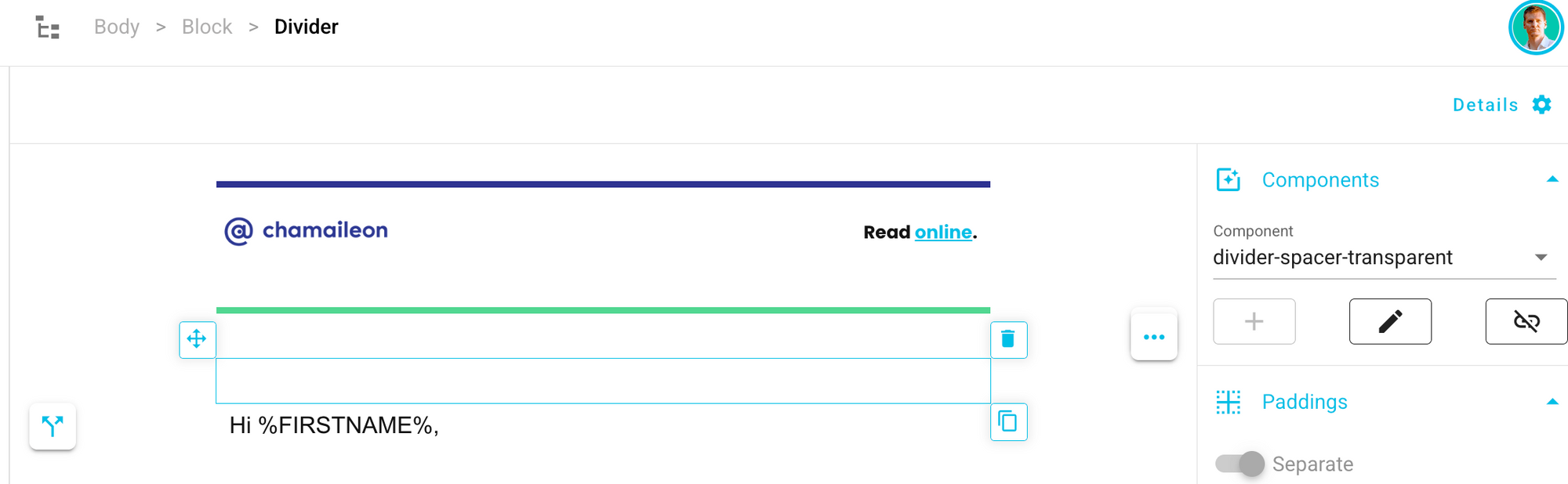
Whitespace Dividers (Spacers) - transparent
No visible line at all — just vertical spacing between sections. Whitespace is the most understated option, and they're surprisingly effective when used well.
Best for: minimalist designs and mobile-first layouts where you want a clean, uncluttered feel.
Implementation: an empty <td> with an explicit padding value. Avoid using <br> tags for spacing different email clients interpret them differently, and you'll end up with inconsistent results.
In better email builders, you'll find a "transparent divider" element or option for it, because it needs to be inserted to the code properly, to stay visible (well, invisible) on all email clients.
Full-Width Color Block Dividers
Instead of a line, you use a shift in background color to signal a new section. The "divider" is the visual contrast between two differently colored content areas.
Best for: e-commerce emails and promotional templates with multiple product zones. Color can do a lot of the structural heavy lifting when you use it intentionally.
For ideas on combining dividers with strong header sections, see our guide to email header design.
How to Create an Email Divider in HTML (Code Examples)
This is the practical part. Below are copy-paste HTML snippets for the most common divider types. Every example uses inline styles and table-based layouts because that's what works reliably across email clients.
Simple Horizontal Line Divider (Border Method)
This is the most reliable email divider method. Instead of using an <hr> tag (which renders unpredictably across clients), we apply a border-bottom to a table cell.
<table width="100%" cellpadding="0" cellspacing="0" border="0" role="presentation">
<tr>
<td style="border-bottom: 1px solid #CCCCCC; font-size: 1px; line-height: 1px; height: 1px; padding: 20px 0 0 0;"> </td>
</tr>
</table>Why does this work better than <hr>? The <hr> tag comes with default margins, colors, and sizing that vary wildly between Gmail, Outlook, and Apple Mail. The border method gives you pixel-level control.
Dotted / Dashed Line Divider
Same structure, different border-style. Swap solid for dotted or dashed to change the visual feel.
<td style="border-bottom: 2px dashed #999999; font-size: 1px; line-height: 1px; height: 1px; padding: 20px 0 0 0;"> </td>Dotted dividers work well in editorial newsletters where you want a lighter touch between sections.
Gradient Divider
For modern email clients, you can use a CSS gradient. But because Outlook doesn't support CSS gradients, you need a conditional fallback.
<table width="100%" cellpadding="0" cellspacing="0" border="0" role="presentation">
<tr>
<td style="height: 2px; font-size: 1px; line-height: 1px; background: linear-gradient(to right, transparent, #666666, transparent);">
<!--[if mso]>
<v:rect style="width:600px; height:2px;" fillcolor="#666666" stroked="false">
<v:fill type="gradient" color="#FFFFFF" color2="#666666" angle="90"/>
</v:rect>
<![endif]-->
</td>
</tr>
</table>The <!--[if mso]--> conditional comment wraps a VML (Vector Markup Language) gradient that Outlook can render. Other clients ignore this block and use the CSS version. For more on Outlook-specific techniques, see our guide on email width and size limitations.
The above code looks like this in Gmail:
Image-Based Divider
When you need a custom decorative divider: a wave, a pattern, a branded graphic — use an image.
<table width="100%" cellpadding="0" cellspacing="0" border="0" role="presentation">
  <tr>
    <td align="center" style="padding: 20px 0;">
      <img src="https://yourdomain.com/images/email-divider-wave-pattern.png" width="600" alt="" style="display: block; max-width: 100%; height: auto;" role="presentation" />
    </td>
  </tr>
</table>
Notice the empty alt="" and role="presentation". Since the divider is purely decorative, we don't want screen readers announcing it. If your divider does convey meaning (like a section label), add descriptive alt text instead.
For a similar approach to other visual elements, check out our guide on email buttons: design and code, or learn how to add a vertical line to your email template.
Image-based gradient section transitions
This one combines the best of both worlds: the visual polish of a gradient with the bulletproof reliability of an image. Instead of relying on CSS gradients (which Outlook ignores) or plain border lines (which can feel too basic for design-heavy emails), you export a gradient as an image file and use it as your divider.
This approach is especially popular in e-commerce and retail emails, where the visual transition between sections needs to feel intentional and on-brand. Think about the typical product email from a fashion or lifestyle brand: a hero image at the top, then a featured collection, then a secondary promotion, then editorial content. Each of those zones needs a clean transition — and a gradient image divider handles that beautifully without any rendering surprises.
The implementation is straightforward. Create your gradient in any design tool (Figma, Photoshop, Canva; anything that can export a PNG), then embed it the same way you would any image divider:
The big advantage here is that you get the exact same gradient in every email client — Outlook included — without any VML hacks or conditional comments. What you design is what your subscriber sees.
<table width="100%" cellpadding="0" cellspacing="0"
  border="0" role="presentation">
  <tr>
    <td align="center" style="padding: 0;">
      <img src="https://yourdomain.com/images/
        gradient-section-divider.png"
        width="600" alt=""
        style="display: block; max-width: 100%;
        height: auto;"
        role="presentation" />
    </td>
  </tr>
</table>
The big advantage here is that you get the exact same gradient in every email client - Outlook included - without any VML hacks or conditional comments. What you design is what your subscriber sees.
Where e-commerce brands really get creative with this technique is in using gradient transitions that match their section backgrounds. Say your featured product section has a white background and your "You Might Also Like" section uses a light gray. Instead of a hard cut between the two, you can use a gradient image that fades from white to gray — creating a smooth, professional transition that guides the eye naturally into the next product zone.
This is a pattern you'll see in emails from brands like Nike, Apple, and ASOS — they rarely use hard divider lines. Instead, they use color-to-color gradient images to transition between sections, which makes the email feel like one cohesive experience rather than a stack of separate content blocks.
A few practical tips for this approach:
- Keep the file size small. A simple two-color gradient exported as a PNG at 600px wide and 20–40px tall will weigh almost nothing — typically under 2KB. That's trivial compared to your product images.
- Match your section backgrounds exactly. If the top section is
#FFFFFFand the bottom section is#F5F5F5, your gradient image should fade from#FFFFFFto#F5F5F5. If the colors don't match precisely, you'll get a visible seam. - Set the image to full width. Use
width="100%"on the image tag so it stretches to fill the content area. And set zero padding on the surrounding<td>— any gap between the image and the section above or below will break the seamless transition effect. - Create a small library of transitions. If your emails regularly use three or four background colors, pre-make gradient images for every combination (white-to-gray, gray-to-white, white-to-brand-color, etc.). Store them alongside your other email assets so your team can reuse them without recreating them every campaign.
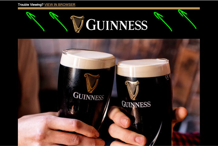
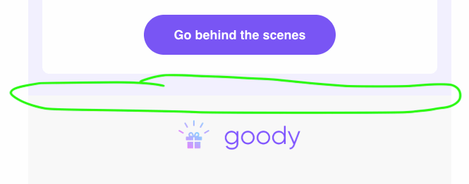
[IMAGE: E-commerce email showing a seamless gradient image transition from a white product section to a light gray recommendations section]
This slots in right after the Image-Based Divider subsection and before Spacer / Whitespace Divider in the code examples section.
Where e-commerce brands really get creative with this technique is in using gradient transitions that match their section backgrounds. Say your featured product section has a white background and your "You Might Also Like" section uses a light gray. Instead of a hard cut between the two, you can use a gradient image that fades from white to gray — creating a smooth, professional transition that guides the eye naturally into the next product zone.
This is a pattern you'll see in emails from brands like Nike, Apple, and ASOS — they rarely use hard divider lines. Instead, they use color-to-color gradient images to transition between sections, which makes the email feel like one cohesive experience rather than a stack of separate content blocks.
A few practical tips for this approach:
- Keep the file size small. A simple two-color gradient exported as a PNG at 600px wide and 20–40px tall will weigh almost nothing — typically under 2KB. That's trivial compared to your product images.
- Match your section backgrounds exactly. If the top section is
#FFFFFFand the bottom section is#F5F5F5, your gradient image should fade from#FFFFFFto#F5F5F5. If the colors don't match precisely, you'll get a visible seam. - Set the image to full width. Use
width="100%"on the image tag so it stretches to fill the content area. And set zero padding on the surrounding<td>— any gap between the image and the section above or below will break the seamless transition effect. - Create a small library of transitions. If your emails regularly use three or four background colors, pre-make gradient images for every combination (white-to-gray, gray-to-white, white-to-brand-color, etc.). Store them alongside your other email assets so your team can reuse them without recreating them every campaign.
Spacer / Whitespace Divider
Sometimes the best divider is no visible divider at all. A spacer creates breathing room between sections.
<table width="100%" cellpadding="0" cellspacing="0" border="0" role="presentation">
<tr>
<td style="font-size: 1px; line-height: 1px; height: 40px;"> </td>
</tr>
</table>Adjust the height value to control the spacing. 20–40px works well for most layouts. Avoid stacking <br> tags for vertical spacing, email clients handle them inconsistently, and you'll end up debugging mysteries.
Email Divider Design Best Practices
Knowing the code is half the battle. Here are the design principles that make dividers actually work in real emails.
Keep dividers consistent. Pick one divider style (or a deliberate system of two to three styles) and use it throughout your email. Mixing solid lines, gradients, and decorative graphics in one message creates visual noise instead of structure.
Match dividers to your brand. The color, weight, and style of your dividers should align with your email design system. If your brand uses a specific line weight or accent color, carry that into your dividers.
Don't overuse them. Not every content transition needs a visible divider. Sometimes whitespace alone is enough. Too many lines make an email feel choppy rather than organized.
Test across email clients. Outlook, Gmail, Apple Mail, and Yahoo each render borders and images differently. What looks like a clean 1px line in Apple Mail might appear 2px thick with extra margins in Outlook. Always test. For a deeper look at rendering quirks, our email rendering guide covers the major clients.
Ensure accessibility. Dividers should not carry meaning on their own. Use role="presentation" on decorative image dividers and keep them invisible to screen readers. For more on this topic, see our guide to email accessibility.
Think responsive. Dividers should scale gracefully on mobile. Avoid setting fixed pixel widths wider than 600px. Use max-width: 100% on image dividers and percentage-based table widths where possible. Our responsive email design guide has more detail on fluid layouts.
Mind the weight. Thin dividers (1–2px) feel modern and minimal. Thicker ones (3–5px) feel more editorial and intentional. Match the line weight to the overall density of your design.
Making Email Dividers Work in Outlook
If you've spent any time building HTML emails, you know that Outlook is the email client that keeps you up at night. Outlook on Windows uses the Microsoft Word rendering engine instead of a browser engine, which means it handles CSS very differently from every other email client.
Here are the specific Outlook pitfalls to watch for with email dividers:
The <hr> tag renders inconsistently. Outlook often adds extra spacing and ignores your color settings on <hr> elements. Stick with the border-based approach instead.
CSS gradients don't work at all. Outlook strips background: linear-gradient(...) entirely. Use the VML fallback shown in the code section above, or fall back to a solid color line in Outlook and reserve the gradient for modern clients.
Border-collapse behavior is quirky. Outlook sometimes collapses or doubles borders on nested tables. Keep your divider markup simple and test it in Outlook desktop specifically (not just Outlook.com, which uses a different rendering engine).
The fix: conditional comments. Use <!--[if mso]--> to serve Outlook-specific code. This is the same approach used for fixing other rendering issues in Outlook. If you need to import your HTML template to Outlook, make sure your dividers are tested before you send.
One more thing to keep in mind: dark mode can also affect how dividers look. A light gray line that's subtle in light mode might vanish completely when dark mode inverts the background. Test both.
How Different Industries Use Email Dividers
The right divider strategy depends on your email type, your send volume, and what your audience expects when they open your messages. Here's how some of the most recognizable brands approach dividers in practice.
E-commerce and Retail (BarkBox)
E-commerce emails are product-heavy, with multiple CTAs competing for attention. If everything looks the same, nothing stands out. BarkBox, a DTC pet supply brand, masterfully uses this approach in their promotional emails—their playful, personality-driven content relies on visual breaks like color accents and decorative line dividers to separate joke sections from actual offers. The distinct zoning keeps their fun, cheeky tone from creating confusion, showing that dividers aren't just functional—they're part of your brand voice. This strategy proves that e-commerce doesn't have to choose between personality and clarity.
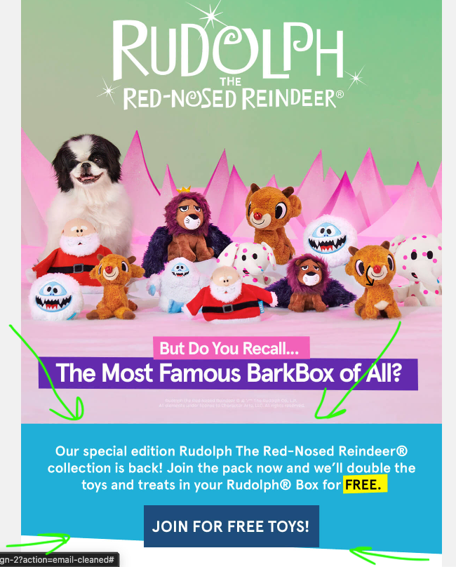
The divider strategy that works: full-width color block dividers or bold lines between product zones, with whitespace dividers between similar items within a zone. Think of it as creating "shelf" sections — the same way a physical store groups products together. A typical layout might flow like this: hero banner → color block divider → product grid → thin line → secondary offer → spacer → footer.
For more on structuring promotional emails, see our guide to product launch announcement emails.
SaaS and Marketing Automation (Omnisend)
When dividers become the design — that's Omnisend's approach. The email marketing and SMS platform uses an almost pitch-black background with stark white content blocks that sit apart from one another, creating massive visual dividers through sheer contrast. The space between blocks is enormous, forcing pauses in reading and making each section feel like its own discrete message. It's a bold strategy that works because Omnisend's audience (e-commerce sellers and marketing professionals) appreciates clarity and scannability over subtlety.
This approach proves that dividers don't have to be thin lines or gradients—sometimes a dramatic shift in background color with generous whitespace is the most powerful separator. The dark-light contrast creates an almost three-dimensional effect on screen, making sections feel physically separated. It's particularly effective for long informational emails where you need readers to slow down and absorb each section independently.
The lesson: if your brand can support it, use color contrast and whitespace as your primary divider strategy. It's more impactful than any border and works across every email client without compatibility issues.
Media, Publishers, and Editorial Newsletters (Substack)
Curated content emails — the kind with five or six article links — need dividers that help readers quickly find what interests them. This is where decorative or branded dividers really shine. Substack, the newsletter platform powering independent writers and publications, leverages sections as built-in dividers for multi-newsletter content under one publication. Readers praise Substack's tag and section system for separating stories and enabling fast navigation, showing that consistent decorative separation reinforces layout learning over time and helps readers know what to expect in each email.
A consistent separator graphic between stories reinforces your editorial identity and helps readers "learn" your layout over time. For more on building a great editorial email, check out our guide on how to create a successful editorial newsletter.
Transactional and Automated Emails (Slack)
Order confirmations, shipping updates, and account emails need to feel structured and trustworthy. This isn't the place for decorative flair. Slack, known for clean product design, carries that into their notification and confirmation emails—subtle line dividers segment channels, alerts, and action items without creating visual noise. Users find this approach trustworthy because the structure is predictable and intentional, not decorative. Integrations like Notion-to-Slack also use dedicated sections for updates, reinforcing that minimal, functional dividers build confidence.
Keep it clean: thin solid lines between the order summary, shipping details, and support info. In transactional emails, dividers serve a functional role — they help users locate key information (tracking number, total cost) at a glance. See our order confirmation email best practices for more on structuring these effectively.
B2B and Professional Services (HubSpot)
Thought leadership and industry digest emails need to project authority without visual clutter. In B2B, less is more. HubSpot, a leader in marketing automation, uses extra <p> tags and inline styling for controlled whitespace between paragraphs rather than hard line dividers. Their community forums highlight this deliberate spacing strategy for creating professional, forwarded-proof designs that work across corporate email clients. By relying on whitespace instead of borders, HubSpot projects authority without decorative flair—a move that resonates with enterprise audiences.
Let whitespace do the heavy lifting and reserve visible dividers for major section breaks only. A typical B2B email might use generous whitespace between paragraphs, a single subtle line between the main content and a secondary article, and no visible dividers anywhere else. The result is a clean, professional feel that matches the audience's expectations.
FAQ | Email Dividers
What is the best HTML code for an email divider?
The most universally supported approach is a table-based border divider. Apply border-bottom: 1px solid #CCCCCC to a <td> inside a presentation table. This renders consistently across Gmail, Outlook, Apple Mail, and Yahoo. See the code examples section above for the full snippet.
How do I add a divider in Gmail, Outlook, or Apple Mail?
If you're building an HTML email template, use the border-based method or a spacer shown in this guide — they work across all three clients. If you're composing a plain email in Gmail or Outlook's editor, you can usually insert a horizontal line from the formatting toolbar, but keep in mind that the result may not look the same in every recipient's inbox.
Are <hr> tags safe to use in HTML emails?
Technically, yes — <hr> tags will render in most email clients. But they come with default styling (margins, thickness, color) that varies significantly between clients. For predictable results, border-based table dividers are a better choice.
How do I make a responsive email divider?
Use percentage-based table widths (e.g., width="100%") instead of fixed pixel widths. For image dividers, add max-width: 100% and height: auto so they scale down on smaller screens. Avoid setting any fixed width larger than 600px.
Can I use CSS gradients for email dividers?
Yes, for most modern email clients. Gmail, Apple Mail, and Yahoo all support CSS gradients. However, Outlook on Windows doesn't, so you'll need a VML fallback or an image-based fallback. The gradient code example in this article includes the Outlook fallback.
Wrapping Up
Email dividers are one of those small design elements that punch above their weight. A simple line or a well-placed whitespace gap can turn a chaotic newsletter into something readers actually enjoy scrolling through.
The practical takeaway: start with the border-based divider (it's the most reliable), test it across the email clients your audience uses, and keep your divider style consistent with your brand. When you're ready to get more creative, experiment with gradients, color blocks, or decorative images — but always test in Outlook before you commit.
Dividers are just one piece of the larger HTML email component puzzle. If you're interested in more component-level email design, stay tuned — we'll be covering email buttons, hero sections, product grid layouts, and more in upcoming guides.