Limitations of HTML Email Design: Width and Size
HTML, or HyperText Markup Language, serves as the backbone for crafting emails with custom designs and content.

Let's break down the basics before we tackle the nitty-gritty of coding emails. HTML, or HyperText Markup Language, serves as the backbone for crafting emails with custom designs and content. Essentially, it’s a tool that transforms boring text emails into visually appealing messages with all sorts of cool features.
It's crucial to note that email coding differs from web coding despite the common confusion between the two. While web coding adheres to widely accepted standards supported by modern browsers, email coding faces a unique challenge. Emails aren't just viewed on computers, phones, or tablets; they're also accessed through various applications.
This diversity means there's no one-size-fits-all approach to coding, and HTML email designs have their unique limitations. What works for one platform might not work for another. In essence, email coding requires adaptability to cater to different devices and apps. So, let’s unravel the potential problems that can possibly happen when coding emails.
Difference between Webpage HTML and email HTML
Here are the basic differences between webpage HTML and email HTML.
| Elements | Webpage HTML | Email HTML |
|---|---|---|
| CSS | In web design, CSS takes center stage as it offers more flexibility than table-based layouts, enabling designers to craft visually captivating and interactive websites, supported by a wide range of browsers and advanced CSS features. | On the contrary, email clients prefer CSS within the head section and don't allow it in an external stylesheet, which helps keep your code tidy. |
| HTML | Webpages use HTML5, supporting multimedia features such as audio, video, and canvas for graphics, including additional form controls like date pickers and search fields. It enhances semantic support with elements like header and footer, enables local data storage, and eliminates the need for plugins like Flash for multimedia content. | Email clients use a wide range of HTML renderers from HTML4, HTML5 compliant web-browser renderers to Microsoft Word as renderer (Outlooks) and wild, custom implementations, which lack support for multimedia like video and audio, don't include built-in features for vector graphics or math formatting and offers limited support for form controls and storing data on the client-side. |
| JavaScript | Web designers can use JavaScript, thanks to its widespread browser support, adding extra fun and interactivity to their designs. | Unfortunately, email designers need to steer clear of Javascript (or any other languages) because it's not supported and poses security risks. |
| Structure & Layout | In web design, CSS and div-based layouts are the go-to choices. CSS gives control over how HTML elements look, while div-based layouts offer flexibility by acting as containers. They let designers create dynamic layouts that adjust smoothly to various screen sizes and devices. | Whereas, emails use table-based or div-based layouts to ensure consistent rendering across various email clients. |
Why do email size and email width matter?
Because HTML email design doesn't allow the use of modern CSS and JavaScript, emails are more static documents that don't adjust dynamically that much. This makes their size and width crucial factors to consider.
Email size
The perfect email size in kilobytes (KBs) depends on what you're sending. Aim to keep it under 100 KB to make sure it loads quickly and doesn't end up in spam folders. There is a limit in Gmail that clips the email content at 104Kb, so be sure your email size is under that limit.
Email width
The size of your email design can determine if your email gets delivered and whether your customers actually read it and act on it. While there's a standard template width of 600 pixels, there are important details you need to know to make sure your email stands out and grabs
Revealing the Ideal Email Width for Your Emails
Following the size guidelines for email templates makes sure your emails look good on any device, giving your audience a smooth experience. Whether you're creating your own templates or using ready-made ones, knowing the correct dimensions and image sizes is key for top-notch emails.
600 px
The width of an email is how wide the message is across the screen, usually measured in pixels. Marketers have traditionally thought that keeping the width around 600 pixels is best. This is because back when devices were slower, and screens were smaller, wider emails could look weird on some email clients.
Many email marketers still believe that sticking to this width is the gold standard for designing effective email templates.
- Mailchimp
- Campaign Monitor
- Getresponse
- Litmus — they sometimes use fancy things like full-width background images or even HTML5 animations in their emails.
- And most free responsive email templates obey the “600px rule”.
Although both mobile and desktop resolutions are getting bigger, 600px is still considered as the safest responsive email width.
That’s why, in Chamaileon, we use the 600px email width as default for every email template. This way you can design templates faster, without adjusting them manually. Of course, you can change this, and we experimented a lot with 720p width emails that look fantastic!
Alternative widths that can be used
To stray from the common practice, you must extensively test the emails on various clients. While we can't cover every size in this article, we'll share a few examples with screenshots to give you a glimpse.
640px
There are a couple of big names among email developers who optimize their email messages for 640px, so this is the first alternate width we are testing.
“…we go for 640px wide quite a lot, as up until recently it made math/retina images easy to think about for 320px wide iPhone screens. 640 also seems to work nicely with some of the common font sizes to give a nice type measure.”
Elliot Ross, actionrocket.co
It took a while to find appropriate responsive email templates to test, but finally, using Beetle.email, we found a couple of nice newsletters like this one from Gap.com.
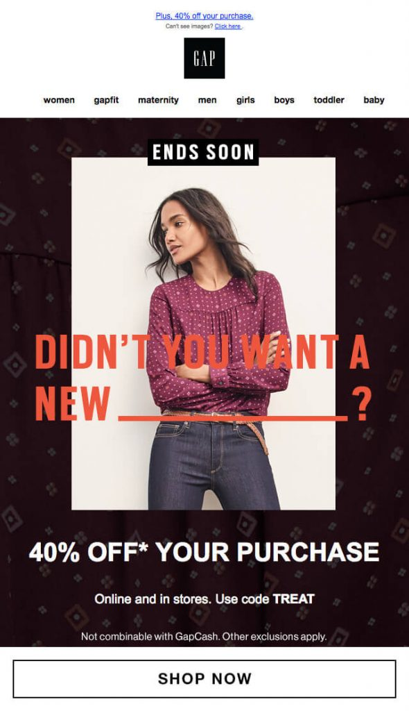
A width of 640 pixels appears to perform effectively across many popular email clients. It's worth noting that while Litmus previews may show Yahoo Mail in fullscreen mode, personal testing in Yahoo Mail proves that the 640-pixel width fits perfectly.
650px
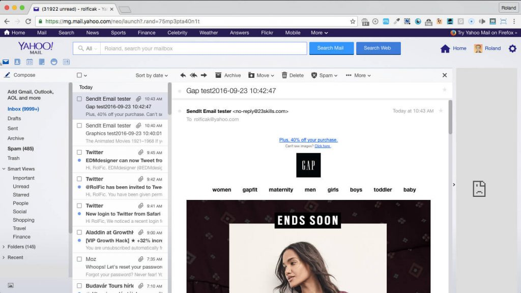
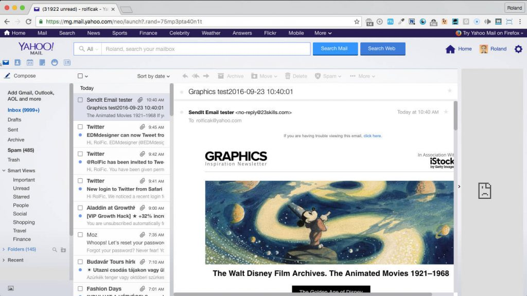
We chose to test 650px since it seemed to be the maximum width that fits into Yahoo Mail at 1366 px resolution. We’ll send this email to our Yahoo inbox too, to see the three-column view.
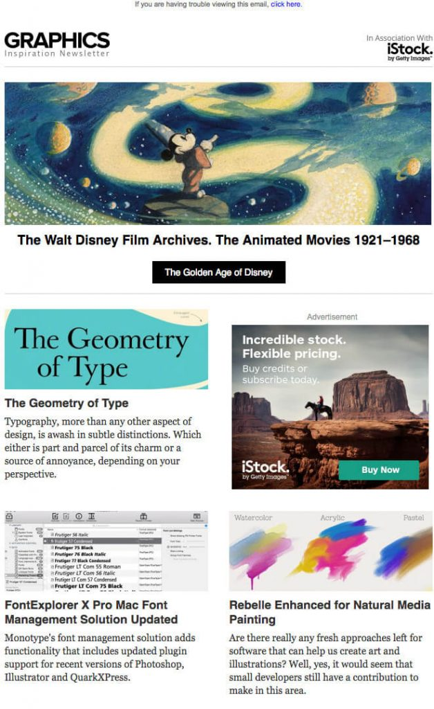
The next piece is a newsletter from Graphics.com, a website that brings you daily graphics, design, and visual culture news, articles, and inspiration.
Here’s the screenshot from our Yahoo Mail.
It shows that the right side of the message is already cut, and some extra white space was added to the left of the template. That white space wasn’t present in the Gap.com example, though.
Let’s check out another — unfortunately not responsive — newsletter from CheatSheet. The content of this email template is exactly 650px wide, but they have a huge promo image on the top with 970px width.

The Litmus test already shows some nasty things in Yahoo Mail, but when we check it in our inbox on 1366px, it looks okay.
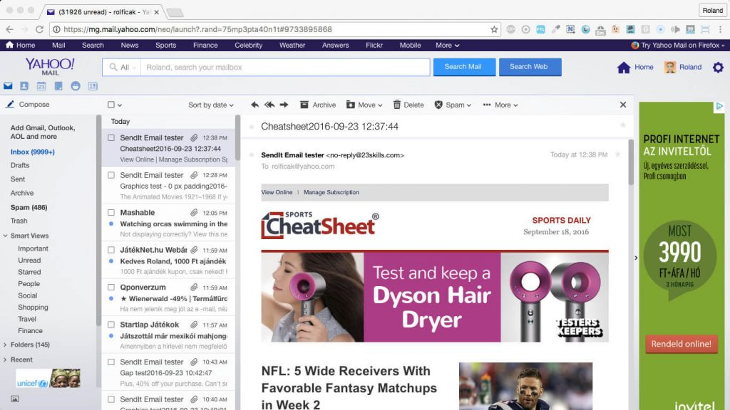
Both of these (more or less) 650px-wide templates had a couple of issues in Yahoo Mail. We don’t think these problems are caused by the 650px width, but rather the improper HTML coding.
Above 700px
Based on the previous tests, we’re 100% sure that 650px+ email templates won’t fit on the screen on Yahoo Mail on the most popular 1366×768 resolution. But anyways let’s run some tests to see the pain.
We took the next newsletter example from Asos.com. It is a fresh, trendy website for fashion lovers. They seem to be fans of modern and minimalist designs, both on their website and in their email designs as well.
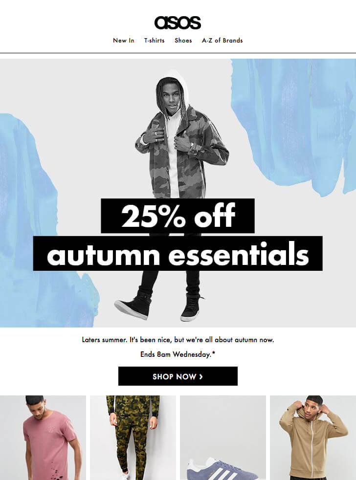
Their mobile-friendly newsletter template has a surprising width of 728px (although there are images with 729px width).
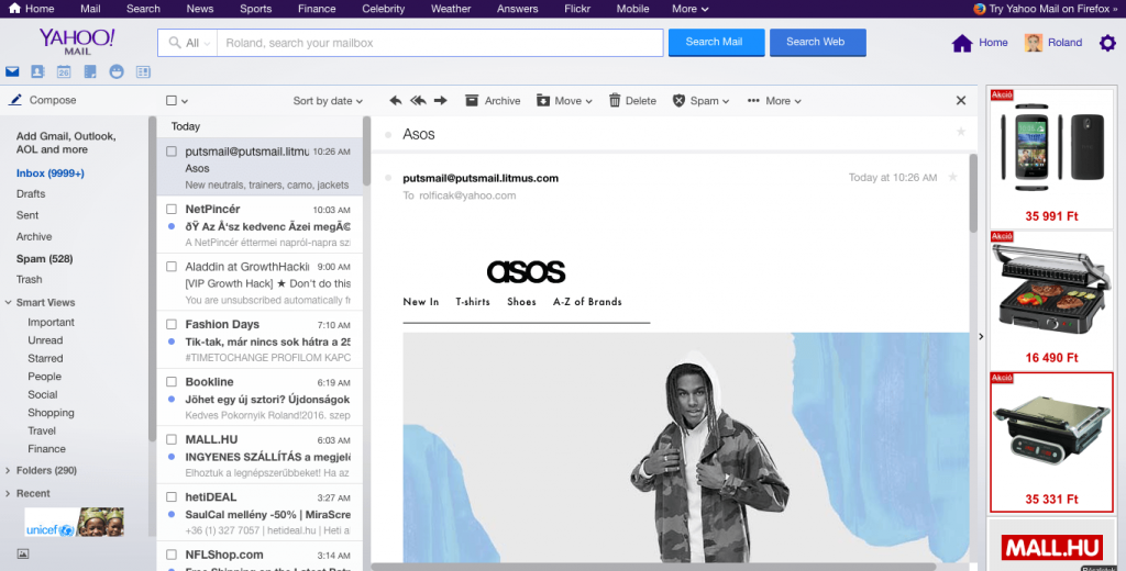
The Litmus test shows that the template breaks in Yahoo Mail: the header image and menu become left aligned, the right side of the template cannot fit into the message area, and the email is truncated as well.
If your email subscribers use Yahoo Mail or Outlook, it's smart to keep your email width under 650px, or stick to the commonly accepted 600px width—just like many other top players in the industry do.
What About Email length?
When it comes to email length, you have more freedom compared to width. It's almost unlimited, except for file size limits. The ideal length for an email template is around 1500 pixels, but you can go further if needed, up to 3000 pixels or more, to fit all your content. However, keep in mind that longer emails are less likely to be read completely. So, it's crucial to prioritize important information at the top, within the first 300-500 pixels, to grab your user's attention.
When your email has loads of content, try using formatting tricks like headings, bullet points, and shorter paragraphs to make it easier to read. Adding images or visuals can also break up the text and make your email more attractive.
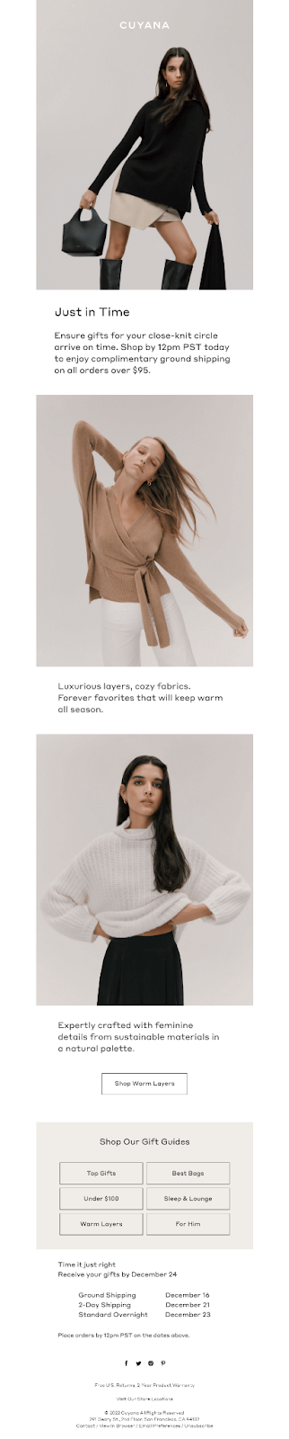
Take a look at this newsletter from Cuyana. Despite being nearly 4000 pixels long, its clear block structure makes it easy to read and navigate.
Size Matters: What’s the Ideal Email Size?
Make sure your email isn't too big! Keep it under 102KB, including text, images, HTML, and attachments. Many email clients have limits on the maximum size they accept, so smaller is better for smoother delivery. There are other things that you should keep in mind. Here’s a table to give you some perspective.

How to Have Complete Control Over Email’s Width And Size
To maintain complete control over the width and size of your emails, implement responsive design techniques to adapt layouts to various screen sizes. Set a maximum width so your email doesn't look stretched on big screens, and avoid fixed layouts that might cause problems on smaller ones.
Make your images smaller to speed up loading times, and use inline styles for consistent looks across all email programs. Test your emails on different devices to be sure they look right everywhere. And remember, keeping your emails short and to the point helps people stay engaged. Design mobile-friendly email templates, as most of the users open emails on their smartphones.
Check out Chamaileon's ultimate guide for creating email design systems in code and optimize your emails effortlessly
Other Important Dimensions that Should Be Considered
Apart from the size and width of your email template, there are some other key parts to think about when crafting your emails. Let’s look into these essential components of marketing emails:
Preheader size
The email preview, sometimes referred to as a preheader, is a concise text snippet visible in email clients or apps adjacent to the subject line. It's like a sneak peek of what's inside the email, giving users a hint about the content before they even open it!
The email preview plays a big role in getting people to open your email. It gives a glimpse of what's inside. Aim for around 50-100 characters for the best impact.
In some emails, you might find a preheader right at the top of the message, before the main header. It could have a link to view the email in a browser, a summary of what's in the email, or other details. It's best to keep this preheader short, about 50-65 pixels tall or 50-100 characters wide. For instance, in the Moda Operandi example, the preheader is 38 pixels tall.

Header size
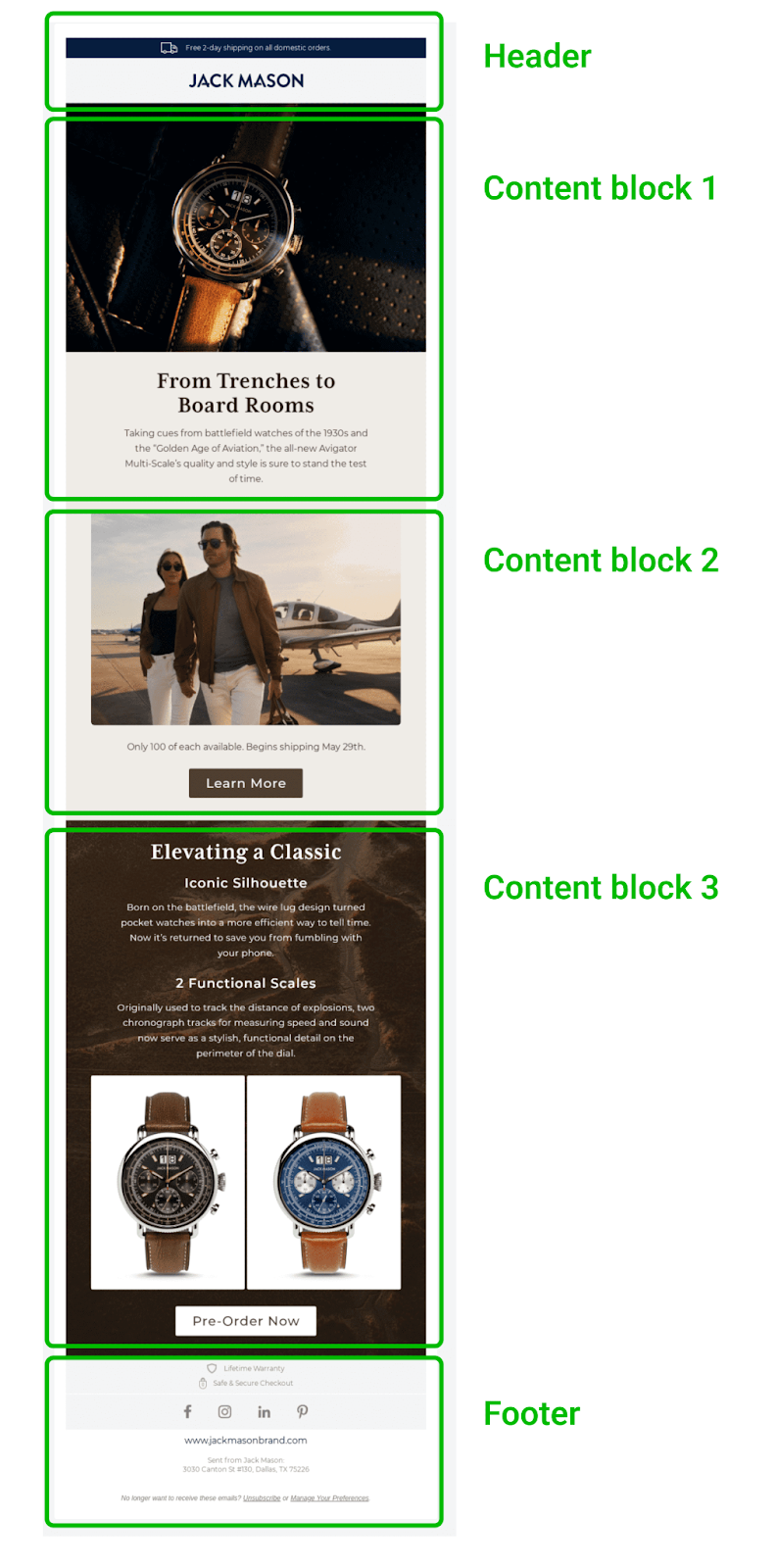
The email header design is the top part of your email, where your logo and branding usually go. It should be about 600-800 pixels wide, matching the width of the rest of your email, and about 100-150 pixels tall. It shouldn't be taller than 200 pixels.
This way, your branding looks clear and noticeable without taking up too much space in the email. Take this Columbia email for instance, its header is 146 pixels tall, and it catches attention with its bold dark gray color.

Content blocks
Now, let's talk about the size of your content blocks in emails. These blocks can contain all sorts of things like text, images, GIFs, videos, and call-to-action buttons.
When it comes to width, your content blocks should match the width of your email template.
But for height, here's the deal: shorter is better. Long content blocks can make people lose interest or even abandon the email altogether. So, aim to keep your content valuable and concise.
Take a look at this email marketing campaign from Julie Blanner. It's got three content blocks:
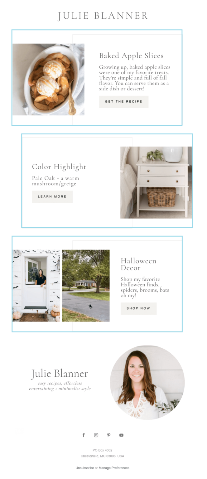
Each content block in Julie Blanner's email is 344 pixels tall, containing an image, text, and a clear call-to-action. The design is minimalistic, making it easy for readers to engage with.
In total, her email content measures 1032 pixels in height, excluding her signature block. Considering this, it's important to keep your content blocks short enough for subscribers to view with just a few scrolls.
So, here's the takeaway:
- Aim for each content block to be around 200-300 pixels tall.
- Ensure the total height of your content blocks falls between 800-1200 pixels.
Moreover, the placement of content blocks can affect the email’s size. It’s because of the email's layout. Here’s more on it.
Email layout
An email layout is like the blueprint for your message. It involves the arrangement and organization of various elements within an email, such as text, images, buttons, and other content.
Plus, it encompasses decisions about the placement, size, and formatting of these elements to create an aesthetically pleasing and user-friendly email design. There are various email layouts such as single-column layout, multiple-column layout, and hybrid-column layout.
Picking the perfect email layout is all about knowing your message, your audience, and making sure it looks great on any device. First, think about what you want to say and what elements are important—like text or images. Then, consider who you're sending it to and what they might like—do they prefer something simple or more exciting?
Also, ensure your layout is responsive, meaning it looks good on both desktop and mobile devices. Lastly, test different layouts to see what works best for your emails.
Despite knowing the best practices for email layout designs, creating a three-column layout where each column takes up exactly 33.33% of the available space can be challenging due to limited support for precise pixel calculations across different email clients. This can lead to layout issues where the design collapses or displays inconsistently.
To address this, designers often use alternative methods such as using tables with percentage-based widths, setting fixed widths for columns, or utilizing hybrid techniques combining tables and CSS to achieve the desired layout while ensuring compatibility with email clients.
But here’s the catch: with Chamaileon, you don’t need to worry about all the complexities, as we help you seamlessly design your emails to be responsive and compatible with all email clients and devices.
But here’s the catch: with Chamaileon, you don’t need to worry about all the complexities, as we help you seamlessly design your emails to be responsive and compatible with all email clients and devices.
Footer
The email footer is the bottom part of your email. It usually has your contact details, legal disclaimers, and links to your social media profiles.
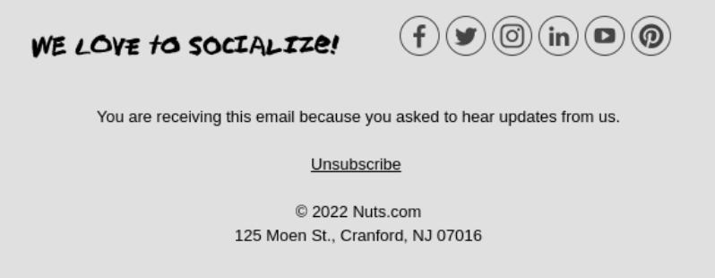
A big footer can clutter your email and make it hard to read. So, it's best to keep it around 100 pixels tall. If you need extra stuff like website links, you can stretch it to 300 pixels. Your contact info should stand out without taking up too much space. In the example above, the footer is 327.4 pixels tall.
Conclusion
In conclusion, understanding the intricacies of HTML email design is essential for crafting engaging and effective email campaigns. From the nuances of email layout and width considerations to the challenges of coding and compatibility across various email clients and devices, there's much to consider.
However, by leveraging best practices, responsive design techniques, and utilizing tools like Chamaileon, designers can navigate these complexities with ease. Remember, the key is to prioritize user experience, ensuring emails are not only visually appealing but also accessible and impactful across all platforms.
By adhering to size guidelines, optimizing content, and testing rigorously, marketers can maximize the effectiveness of their email campaigns, increase email deliverability, and ultimately drive better engagement and conversions.
Frequently Asked Questions for Limitations of HTML Email Design
1: Does email size influence email’s deliverability rate?
Yes! File size matters because it can impact your email’s deliverability but could lead to parts of your message being cut off. So, it’s best to keep your HTML email files under 100KB.
2: Does email height affect its responsiveness?
Not really. When we talk about responsiveness in emails, we're mostly concerned with how they adapt to different screen sizes, which is more about width than height. However, if an email is super long, it could affect how engaging it is, especially on mobile devices where scrolling a lot might be annoying. So, it's best to keep emails short and sweet for a better experience across all devices.
3: Do large email widths make images more impactful?
Bigger is not always better! For the best quality, aim for images in emails to be between 600-800 pixels wide. Compress them to make the email load faster. Keep image files under 200 KB, with a maximum of 1 MB. For GIFs, aim for under 500 KB, but don't go over 1 MB.