Email Button Design: The Complete Guide
An effective email marketing strategy provides high ROI and engages customers at the right times.

An effective email marketing strategy provides high ROI and engages customers at the right times. Consequently, it enhances your sales and grows your business. But how do you measure the success of your email campaigns?
When measuring an email marketing strategy's success, there are several key performance indicators (KPIs) to consider: conversion rates or click-through rates (CTRs). CTRs represent whether audiences are taking action on your emails or not.
Therefore, you need compelling call-to-action (CTA) buttons in your emails. Once customers open your emails, the next thing you want them to do is take prompt action.
Email button designs play a crucial role in whether subscribers will click through or not. But before that, let's understand what email buttons are.
Simply put, email buttons are call-to-action buttons that tell customers what to do next. When users open emails, there is a lot of content on them, but the sole purpose of your email campaign is to bring them to your company's website to take action.
For example, a retail business may incentivize customers (by offering a special discount) who abandoned their shopping carts to complete a purchase through targeted email campaigns.
While there are several ways to create brilliant email buttons involving those with different weights, font sizes, and background images, bulletproof buttons are among the most popular types.
What Are BulletProof Buttons And Why Are They Important?
Bulletproof email buttons are call-to-action (CTA) buttons that work in every email, either with or without images. They are written in HTML with no images, thus appearing the same across all inboxes.
Here are the reasons why you should use a bulletproof email button design.
Images might not load quickly if your internet connection is slow, which can happen in areas with weak or patchy service.
- Visually impaired subscribers won't understand GIF or JPEG images through screen readers, making your email inaccessible to them.
- Some people turn off automatic image downloads to protect their privacy and avoid being tracked.
4 Ways To Create Bullet Proof Emails
Considering the importance of bulletproof buttons, here are four ways to help you ace the process.
VML buttons
The VML-based email button design utilizes the styling on the link to style and structure the button for most email customers. These buttons deliver structure through width and line-height properties.
Vector Markup Language (VML) is utilized within an Outlook-specific conditional comment as an alternative to Microsoft Outlook. The VML generates a box around the required link in Outlook. Then, it styles the anchor tag to produce the button design for email clients.

Padded buttons
This approach uses an HTML table to create buttons. It depends on padding at the table cell level to structure the button. Moreover, it utilizes CSS and HTML attributes to style the button.

Border-based buttons
A border-based bulletproof email button is similar to a padded bulletproof button. Both methods use HTML and CSS to create and style the button. However, thick borders are added around the link instead of using padding to shape the button within the table cell to give it structure.

Combined padded
Combined-padded, also known as border bulletproof email buttons, use padding, a solid border, and a background color.
These buttons are easy to update and easily support background images.

How to Create Email Buttons?
Crafting an engaging call-to-action (CTA) button in an email is crucial for encouraging recipients to take the desired action.
Here’s a step-by-step process to help you create effective email email button designs using HTML and CSS.
While each email client processes CSS and HTML differently, we want them to work the same in each client. You can face two significant problems while creating a button using HTML, namely, the flexibility and clickability of it.
Usually, when people design buttons, they use padding or a border. Although the button crafted with a border is relatively flexible (you don’t need to specify dimensions), and the whole button is clickable, it doesn’t function properly in Outlook. On the contrary, buttons designed with padding work in Outlook, but only their text is clickable.
To resolve this issue, you can combine padding and borders to create an impeccable email button design that will never fail to function.
- Firstly, use HTML to produce a wrapper table with the actual button table inside. The wrapper ensures that the button stays in place. Then, create a cell in the button table to give a background color.

- Afterward, apply the border and padding to the link to ensure the whole button is clickable. The display style must be inline-block to let the horizontal padding function properly.

You can use inline styling in your emails to avoid working with classes.

Design Emails That Leave a Lasting Impression With Chamaileon
Tips to Design Buttons in Email That Convert
Here are a few practical tips for email button designs that actually convert!
Avoid Using Images
Design call-to-action button that does not use images to ensure better loading times and compatibility for email clients. Image only emails may appear attractive, but they don’t work if subscribers turn off images in their email settings. Therefore, use CSS and HTML to style buttons rather than relying on images.
Also, it makes your email button more accessible, searchable, and easier to scale across various devices.
Background image
The use of background images in email buttons instantly grabs readers' attention and adds to the design's overall appeal. Moreover, their strategic use helps improve your brand identity, fostering trust and recognition among your users.
For better understanding, below is an example of a subtle background texture that improves the visibility of the email button. Check out the darker blue wave behind the design of the CTA button. This background image adds depth to the design, making it more interesting than just a plain block of one color. And trust us, having a solid blue background is way better than the alternative!

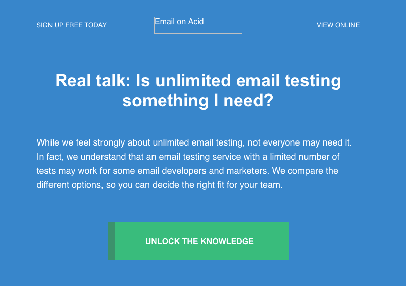
In the example, the email is coded with a solid background color behind the image to ensure it remains readable even if the image is blocked. For instance, in Outlook, where images might be blocked, the email still maintains its readability. If the background image were blocked and the background was white, a significant portion of the email would become unreadable.
Shape
To make buttons appealing and clickable, they should have a clear shape (usually rectangular or rounded), stand out with a contrasting color, and contain clear text. Avoid using gray buttons, as they may look disabled. Instead, opt for colorful buttons with prominent text to encourage clicks.
Size
When sizing your button, make sure the text stands out, especially on mobile devices, with a font size of at least 16 pixels. Also, avoid making the button too big, as it can decrease clicks. You must ensure the button is touch-friendly for mobile users. Thus, for optimal user experience on mobile devices, clickable design features should be between 42px and 72px (approximately 11-19mm).
To help you gain perspective, use the Squint Test: if you can easily spot the button without it taking over the page, you're on the right track.
Consider the example below! The text on the buttons really grabs your attention and practically begs to be clicked.

Space/Padding
Text spacing is critical for your email buttons to stand out. Make sure there's plenty of whitespace around your buttons to make them stand out and easy to click on. Imagine having multiple links crowded together in a paragraph - it would be challenging for subscribers to click on the right one, especially on mobile devices. So, give your buttons some breathing room for better results!
Pro tip: Place your main call-to-action button near the top of your email. This way, users can easily spot it without scrolling. It helps them quickly understand your message or offer.
Text/Fonts
Keep your call-to-action (CTA) text clear and brief, typically 1 to 5 words. Tell users what you want them to do clearly and concisely. This makes your email easy to read and scan.
If you need to include more information, use a headline above the button. Keeping your CTAs short makes them more impactful.
Fonts in email play a crucial role. For example, fonts that are hard to read, where F and P or C and G look similar, can hinder the success of your email marketing campaigns.
However, selecting a highly-rated font style and size can increase your email's readership. Once you find the best fonts for email, you'll see consistent improvements over time.
Color
Well, different colors evoke different emotional responses. To pick the right color for your campaign, consider the feelings you want to elicit and the actions you want people to take.
However, emphasizing color contrast is even more critical. Whatever color you choose, it should enhance your email button's visibility, increasing your conversions. When designing a CTA button, pay attention to two types of color contrast:
- Contrast between the background and the button color.
- Contrast between the button color and the button text.

Check out this example of an eye-catching CTA button with contrast.
In fact, studies indicate that brands can boost sales by over 35% by ensuring their CTA color stands out.
Also, keep in mind the visual hierarchy when designing CTA buttons in your emails. Your main call-to-action (CTA) button should always stand out the most. Use vibrant colors and make it the largest button. As for other buttons, like secondary options, keep them less eye-catching.
Your email's design plays a big role in how people engage with it. To keep things cohesive and boost conversion rates, ensure your email design matches your brand's overall look and feel. Consistency is key across all platforms. Plus, by keeping your email button designs in line with your brand, you're reinforcing your brand’s identity every time someone clicks.
5 Examples of High-performing Buttons in Email
Netflix always convinces its users to take action when they sign up. Whether with a "Cancel anytime" message or a "Join free for a month" button, everything they do works like a charm!

Check out this seasonal email from Harry's. They've nailed the winter vibe by using cool colors like green, blue, and brown for their gift set promotion. Plus, they've made it easy to skim with a simple tile layout. And those bright red buttons? They're practically begging to be clicked.

The email design looks sleek and simple, using empty space and attractive fonts cleverly. It perfectly fits the brand's vibe, especially for a women's fashion company. We love that button at the end. It's in their signature orange color, making it irresistible to click!

Sometimes, a fun and unique CTA is all it takes to get people clicking. Grey Goose came up with this creative CTA, offering a delightful break from the usual practice. After all, who doesn’t love personalization?
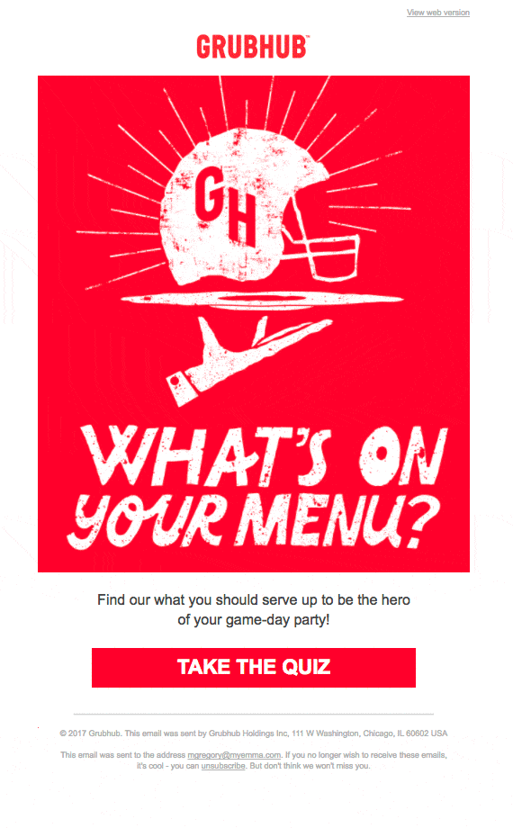
Check out this email from GrubHub—it's a brilliant way to promote their product without feeling like a sales pitch. Instead of just saying, "Order food with us," they've created an interactive quiz to help you decide what to serve at your party. The best part? The button stands out, inviting you to dive right into the fun quiz!
Create Email Buttons for Dark Mode
With dark mode becoming popular with email clients, we must consider how it affects our background images. Dark mode email can sometimes mess with image contrast, making text hard to read when switching between light and dark backgrounds.
To tackle this, try the "dark mode image swap" trick. Basically, you make two versions of your image: one for dark mode and one for light mode. Then, using a smart code called prefers-color-scheme, your email can pick the right image based on the recipient's theme. It's a neat way to keep your emails looking sharp and readable no matter what mode people prefer.
Conclusion
Mastering the art of CTA button design is essential for any successful email marketing campaign. You can significantly enhance user engagement and drive desired actions by incorporating effective call-to-action buttons, such as bulletproof designs that work across all email clients.
Remember to prioritize factors like accessibility, readability, and visual appeal when crafting your buttons, and consider experimenting with various design elements to find what resonates best with your audience.
With the rise of dark mode in email clients, adapting your background images using techniques like dark mode image swapping ensures your emails remain visually appealing and accessible to all recipients.
By implementing these strategies, you can create email buttons that not only grab attention but also inspire action, ultimately driving the success of your email marketing endeavors.
Design Emails That Leave a Lasting Impression With Chamaileon
Frequently Asked Questions About Buttons In Email
- How many buttons should you include in your email?
There's no set rule, but if you're adding more than three, each one should have a really good reason.
2. Why should you add a button in an email?
Email buttons prompt subscribers to act, helping you effectively draw attention to your call-to-action (CTA).
Without a clear CTA, subscribers are less likely to act. Using hyperlinked text instead of email buttons can be confusing for subscribers since the text may not clearly indicate what action to take.
3. Can you opt for text-only buttons?
Yes, adding a Click-to-Text link or button makes your website more mobile-friendly and simplifies the process for customers to contact you.