Email Accessibility-The Ultimate Guide for Marketers in 2024

Did you know that while 77% of marketers agree that email accessibility is important for their brand, only 8% actually stick to email accessibility best practices? Why the gap? Many think making emails accessible is tough, but it's not as daunting as it seems.
In our Ultimate Guide to Email Accessibility, we'll show you:
- Why email accessibility is crucial and how it impacts your business.
- Tips for writing and designing emails that everyone can enjoy.
- Easy HTML and coding tricks to ensure your emails are accessible across all devices and assistive technologies.
What is email accessibility?
Email accessibility means making sure everyone, including people with disabilities, can easily read and understand your emails. It involves considering diverse needs of subscribers such as those outlined by the Web Content Accessibility Guidelines (WCAG) and the Americans with Disabilities Act (ADA). Sometimes, technical stuff can make parts of your email hard to access.
For example, links are usually blue, but what if someone can't see that color? They might not know where to click. So, you could underline the link or use a different color or style to make it stand out.
Also, Outlook (web) can't handle fancy features like AMP for emails, but Gmail on Android can. So, if you send an email with AMP to someone using Outlook without a backup plan, they might not be able to see your email at all.
Why does accessibility matter?
Modern scenarios accessibility is used
Ensuring email accessibility is crucial, especially with the increasing use of voice assistants and AI tools:
- Alexa reads the entire email but skips image alt texts.
- Siri reads the sender’s name, subject line, and preheader.
- Microsoft Copilot Pro for Outlook can only read emails from Outlook.
- Google Assistant doesn't support email reading at all.
- CarPlay reads emails out loud to you while you’re on the road.
Why is this important and how does it work?
When an email lacks proper text versions linked, meta-tags, alt-tags, and adherence to accessibility standards, it becomes inaccessible to these tools. Here's why:
- Voice assistants like Alexa, Siri, Google Assistant, and tools like Microsoft Copilot Pro for Outlook rely on text to read and interpret the content of an email. If an email is composed entirely of images, or if it lacks proper HTML structure, these tools cannot decipher the content accurately.
- Tools like CarPlay read emails aloud while individuals are on the road. In such scenarios, accessibility is not just a matter of convenience but also a safety concern. If an email is not accessible, it may pose challenges for individuals relying on these tools to stay informed while driving.
Statistics on disabilities and accessibility
Email accessibility is crucial because many users live with various types of disabilities.
It's possible that some of your users have disabilities you might not be aware of. Let's explore some statistics related to the prevalence of these disabilities:
- Over a billion people have some kind of disability, according to the WHO.
- About 2.2 billion people have trouble seeing.
- Color blindness affects 1 in 12 men and 1 in 200 women.
- Around 15% of people struggle with reading due to dyslexia.
- By 2050, nearly 2.5 billion people might have hearing loss.
So, if your emails aren't accessible, you're missing out on reaching a big group of folks and giving them a not-so-great email experience.
Types of Disabilities
By prioritizing accessibility, you're catering to a range of disabilities and impairments. From vision and auditory challenges to cognitive and physical limitations, your email design can make a big difference.
Ensure clear contrasts, readable fonts, and keyboard navigation for vision impairments; captions and transcripts for auditory issues; simplified layouts and instructions for cognitive difficulties; easy navigation and action for neurological conditions; and options beyond phone calls for speech impairments. Plus, ditch the no-reply email address to encourage inclusive communication.
Emails for Everyone: The Ultimate Accessibility Ebook.
The 4 WCAG Email Accessibility Guidelines / ADA Email Compliance
Email accessibility traces back to the ADA email compliance guidelines from The Americans with Disabilities Act of 1990. However, these guidelines lacked clarity. Then came WCAG (Web Content Accessibility Guidelines) in 1999, specifying that emails should have a logical order, use headings, ensure enough color contrast, provide alt text for images, use meaningful link text, and include descriptive subject lines.
Additionally, WCAG introduces four principles crucial for improving email accessibility across organizations.
Perceivable
From an email accessibility perspective for people with disabilities, consider these elements for your emails:
- ALT text for images
- Good color contrast
- Email design that functions without relying solely on colors
- Subtitles for embedded videos, if included
Operable
Operable emails ensure users can interact with them using alternative methods. To achieve this:
- Make navigation easy with the keyboard (using tabs).
- Use descriptive links to clarify their purpose.
- Ensure elements, especially animated GIFs, are displayed for an adequate duration.
- Avoid visuals that may trigger seizures or other unwanted physical reactions.
Understandable
To ensure your text is clear for screen reader users:
- Start by indicating the language at the beginning of the email.
- Follow familiar writing styles for consistency.
- Above all, focus on making your text easy to read, both in terms of design and content.
Robust
Your content should be strong enough to work well with various user agents and assistive technologies used by people with disabilities. For us, this mostly involves screen reader apps, which aren't always easy to use.
Role of Email Accessibility in Enhancing Marketing Efforts
Overlooking accessible emails not only disregards subscribers with disabilities but also means you're missing out on opportunities and could face problems in your marketing. Here are seven reasons why making emails accessible boosts your brand's marketing efforts:
Increased Reach
Accessible emails ensure that everyone on your list, whether they have permanent disabilities or temporary impairments, can receive your message. If your emails aren't accessible, you're leaving some of your audience out and limiting your reach.
Enhanced Engagement
If subscribers can't read your email or click your call-to-action (CTA) buttons, they can't really join in the fun. Plus, they might not stick around for more emails later. This hurts your email game and increases your unsubscribe rate.
Improved Brand Reputation
Understanding your audience is key to great marketing. When you make your emails accessible to everyone, you're really tuning in to what they need and showing you get their daily grind.
Seeing your subscribers as real people, not just entries in a list, proves you care about them. According to the Association of National Advertisers (ANA), a whopping 92% of consumers want brands to show empathy. That means crafting emails that work for everyone, whether they're dealing with temporary or permanent impairments, and truly understanding how they connect with your brand.
Regulatory Compliance
Website accessibility lawsuits surged by 12% in 2022 compared to the previous year. And that's not all—there were likely many more unreported cases and out-of-court settlements. Lawsuits pose a serious threat to companies that don't cater to their entire audience. Beyond the financial impact, they can damage brand reputation when customers hear about them, even if they lack merit. Hence, ensuring regulatory compliance is crucial in mitigating these risks and maintaining trust with your audience.
Enhanced User Experience
Many of the top strategies for boosting accessibility in email marketing also enhance the overall email experience for all users. It’s because such emails look good on any screen size, use fonts that are easy to read, and have alt text to images understandable for everyone.
Higher Conversion Rates
Accessible emails are key to enhancing conversion rates as they ensure inclusivity and maximize engagement. By enabling all recipients to access your content, you widen your audience reach, driving more conversions. Take seasonal promotions, for instance; accessible emails enable everyone to participate, resulting in increased sales and campaign success.
Competitive Advantage
Imagine you're comparing two emails from different brands. One you can easily read and interact with, while the other is a struggle. Which one do you think you'd click on? Who do you think would win your business?
Even if you've been loyal to the other brand, if their emails are hard to engage with and understand, you might start leaning towards the more accessible option. Accessible emails often win the race, even against long-time competitors.
HTML Email Accessibility Standards for Copywriters
At Chamaileon, we're all about email design, but we know that killer design needs killer content to truly succeed. It all starts with the words.
But before we get into that, let's talk about what gets your email opened in the first place: the sender's name, subject line, and preheader. These need to be interesting and trustworthy to grab attention. And remember, Siri and Alexa will read these out loud, so they need to sound good even when spoken.
Plus, if you follow some simple accessibility rules, you're already ahead of the game. These rules aren't hard, and they'll make your emails better overall.
Write a readable email copy
Writing easily understandable copy is the first step towards creating accessible email content that everyone can enjoy.
So, keep your sentences short. Long ones are tough to read. Short ones are easier to understand.
Moreover, avoid jargon and big words. Shorter words are better as they're easier to read and understand.
You can test how easy your email is to read with the Flesch Reading Ease test. Aim for a score of 60-70. That's plain English, easy for teenagers to understand. Likewise, you can use tools like Readable.io, Grammarly, or Yoast to check your score for free.
Use headers & hierarchy
Using different header levels helps subscribers using screen readers understand your message's structure more easily.
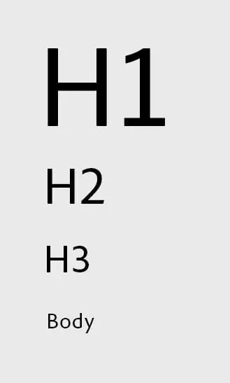
Besides, if you're building your email design system, it's wise to stick to specific headings and text styles.
Avoid all caps
Not only does it appear you’re SHOUTING online using all capital letters, but it also makes it tough for people with dyslexia to read. About 5 to 15% of people are living with dyslexia, and all caps make it hard for them to tell letters apart.
Avoid justified text
Justified text might seem nice for design, but it's tough for readers with dyslexia as well as those without dyslexia. That's because it creates uneven spaces between letters and words. When these spaces line up, it can create distracting gaps in the text.

This can make it hard for readers with dyslexia to keep track of where they are while reading. To avoid this, use left-aligned text instead of justified text for your paragraphs.
Use left-aligned text and use short center-aligned text (e.g., headers)
Center-aligned text affects accessibility, especially when it's used for paragraphs rather than headlines. Litmus suggests that if the text spans more than two lines, it's best to align it to the left.
While center alignment is common in email designs, it's often overused. Brands like Starbucks, Disney, Airbnb, GoPro, and Nike sometimes disregard this rule, making their emails hard to read for people with and without dyslexia.
It’s preferable that you use left-aligned text for readers with dyslexia if it is more than three lines. In the case of Arabic, use right-aligned text.
Always break up large blocks of text
Break up big blocks of text to make it easier for users to understand. Short sections are much easier to read than one big chunk. See the example below.
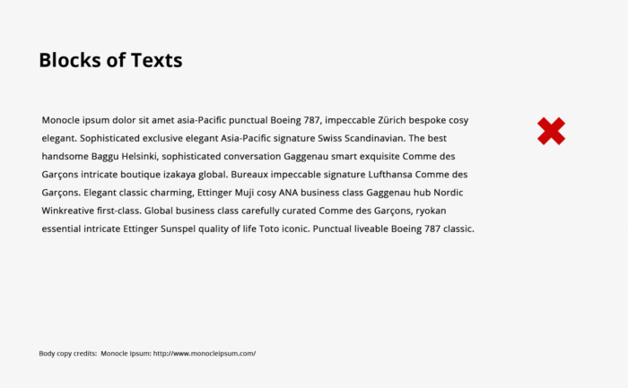
It's a good idea to keep paragraphs short, ideally no longer than five lines each.
Emphasize with bold text styles
Use bold text to emphasize important words and phrases. It doesn't just look better; it also helps people with dyslexia to understand the text more easily.
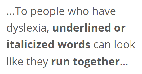
So, choose bold text for emphasis rather than using italics or underlining.
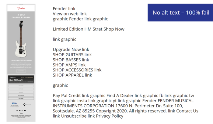
Use ALT text for images
ALT text in emails is crucial because it's read out loud by screen readers, and images can be blocked in some email clients. Writing the right ALT text can be tricky, but here's what you need to know:
- Avoid repeating ALT text.
- Keep it descriptive and short, ideally under 100 characters.
- Remember, ALT text isn't the same as title text.
- Leave ALT text empty for illustrations.
- Add style to your ALT text.
Don't use ALT text like "Please enable images for your email." Screen readers often read both ALT and title text, which can be annoying for users. Here's what to avoid:
Avoid using ‘click here’ link copy
Instead of using "click here" for your links, give them context. Screen reader users often scan emails by tabbing through content. Contextual links help them decide if they want to click or not.
Here's an example: Instead of using "click here" for a link to a product listing of shoes, use something like "See more shoes." This makes the link clearer for screen reader users and benefits all subscribers. It saves them from having to read around the link, especially for those who scan emails.
Plus, moving away from "click here" links makes your email content work better across different devices. While "click here" might be okay for laptop or desktop users, it doesn't make sense for mobile or tablet users who tap instead of click.
Email Accessibility Best Practices for Designers
To design accessible emails, consider the following best practices.
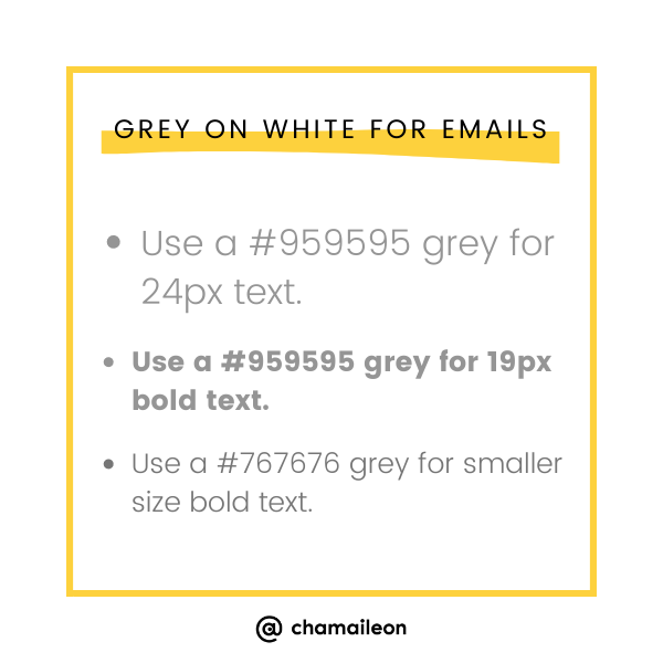
Don’t use (light) gray as your text color
Always prioritize readability over design aesthetics when choosing text colors for your emails. Remember, using excessively light gray can hinder readability.
When it comes to choosing gray text colors, a good rule of thumb is to avoid shades lighter than:
- #959595 for text size 24px or 19px when bold.
- #767676 for smaller text.
Optimize call-to-action size and spacing/make them tappable
Ensure your email buttons are just the right size and spaced out well. According to accessibility guidelines, the ideal size for a call to action is 44x44 pixels, but Google suggests going a bit bigger to 48x48 pixels.
Also, for spacing, Microsoft suggests 8px, while Google recommends at least 32px. We're inclined towards Google's advice because it's more eye-friendly. For example, here's how a checkbox in an email might look:
In this email, the checkbox is 28x28 pixels, with margins of at least 20 pixels around it. This gives the button an overall size of about 48x48 pixels, ensuring it's clear and easy for any reader to see and interact with.
Make CTAs distinguishable from other email elements
Ensure your clickable links and buttons stand out from other email content. Simply changing the color won't help users with color blindness. Here's what to do:
- Make links and buttons larger for easy identification.
- Avoid generic CTAs like "click here" or "learn more." Instead, use descriptive text like "Read our email accessibility guide."
- Add a hover effect using the :hover pseudo-selector to show users that a link or button can be clicked.
Optimize the contrast ratio
Ensure that the contrast ratio between text and its background meets accessibility and inclusive design standards. For smaller text, aim for a ratio of around 4.5:1, and for larger text, aim for 3:1. Use tools like contrast-ratio.com to check.
Remember, don't round up if you're close to the standard. For instance, if your ratio is 4.45:1, make adjustments for compliance. Here's an example for better understanding.
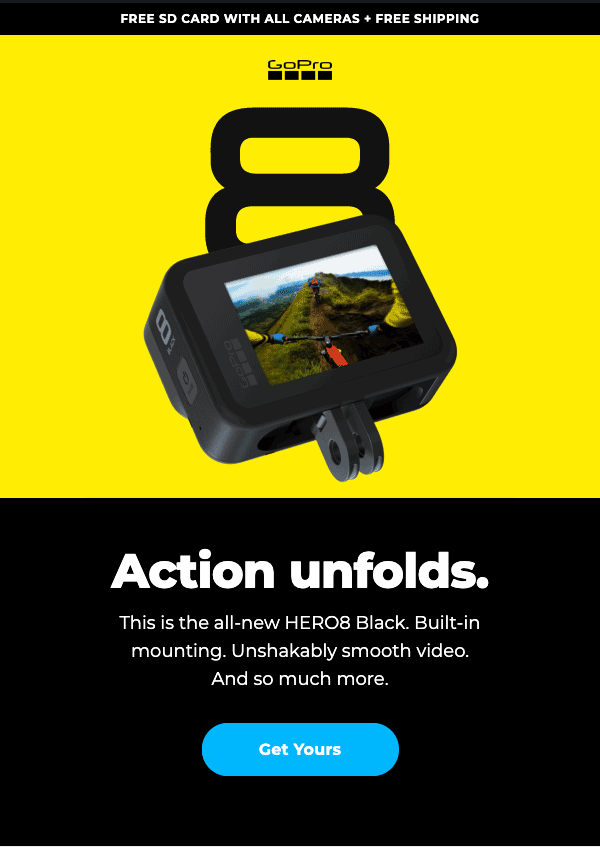
This GOPRO email aligns with accessibility guidelines. The main GIF in the email boasts a high contrast ratio of 13.57:1.
The call to action button in the email maintains a strong contrast ratio of 9.88:1 with its blue color against the black background. However, the white text on the blue button doesn't meet the contrast ratio requirement, measuring only 2.12:1.
Use colors intelligently
Don't rely solely on color to convey information in images or charts. Instead, consider adding distinctive patterns to each section. This approach ensures that people with disabilities can understand the content even if they can't distinguish between colors. Patterns and clear labels make information more accessible to everyone.
Use legible typography
Good typography matters for email legibility. Here's how to nail it:
- Stick to easy-to-read fonts like Sans-Serif.
- Choose font sizes that work across screens and for everyone, like 18px for headlines and 16px for body text.
- When you want to emphasize something, go bigger instead of using all caps.
- Keep letter-spacing just right; fonts that are too close together can be tough to read.
Keep email layout simple
To make emails easier for everyone, especially those with disabilities, keep the layout simple. Too many images, tables, and links can overwhelm readers. Stick to a single-column layout—it helps users find and understand content better. Plus, it's mobile-friendly.
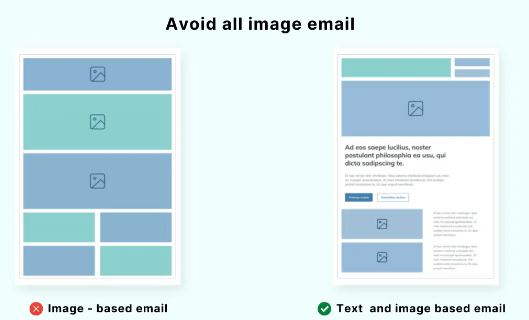
Avoid image-only emails
Avoid simply dropping images into your emails—it's not the best practice. Some email clients block images, and alt text doesn't fully describe them. Plus, screen readers only read the alt text. So, don't turn your emails into infographics. Instead, lean towards text-based emails, keeping a balance of 80% text to 20% images.
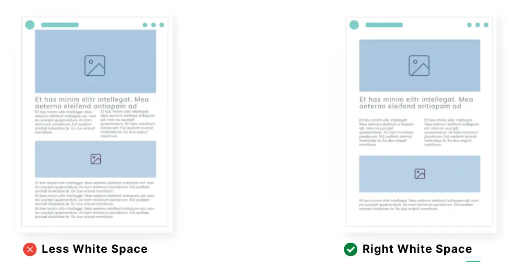
Treat white-space as your friend
Don't cram all email elements together; it makes things tough for users, especially those using screen readers or keyboard navigation. Leave enough white space around elements so they're easy to grasp.
Make emails responsive
Since users read emails on various devices like mobiles, tablets, and PCs, it's vital to ensure your emails look great on all screen sizes. Therefore, embrace responsive email design for better readability and engagement.
Keep in mind dark mode emails
Overlooking dark mode when designing emails can seriously affect how readable your content is. For instance, light text on a dark background strains the eyes and makes reading tough, especially for those with visual impairments.
Code HTML Emails with Better Accessibility
While your subscribers won’t see the code, email developers can do a lot to improve accessibility behind the scenes. Some practices rely on coding techniques. For example, using inline CSS ensures a minimum font size of 16px.
It's important to start with basics like adding alt text for images and coding bulletproof buttons with live text. These steps make the email experience better for screen reader users. But there's more to do.
Semantic HTML adds meaning to your email code, helping assistive technology understand it better. For instance, using <em> or <em> tags for italicizing text serves different purposes.
Using <p> tags for paragraphs is preferred over line breaks <br> because it adds structure.
Using <h1>, <h2>, <h3>, etc., for headings organizes content logically and aids keyboard navigation for subscribers using assistive technology.
While ARIA (Accessible Rich Internet Applications) attributes aren't fully supported in email clients, they still have value. For instance, role="presentation" tells screen readers that a table is for layout, not for presenting data.
Another useful ARIA attribute is aria-hidden="true", which hides certain elements from screen readers, like decorative graphics or duplicative content.
Tools to Help You Conduct an Email Accessibility Test
Use accessible-email.org to check the accessibility of your emails. It's a useful tool created by Maarten Lierop & Jordie van Rijn.
All you have to do is paste your email HTML, and it'll quickly analyze:
- Headings
- Link labels
- Image ALT texts
- Document title, language, encoding
- If role="presentation" is used to show which tables are just for layout.
Checking color contrast can be a bit of a hassle. There's no magic tool that automatically analyzes font and background colors in your email. You'll have to input the color codes into a Contrast Ratio Checker and make sure the ratio is above 4.5:1.
It's crucial to test the contrast ratio thoroughly, especially when building your email design system. Once you've got it sorted and your email blocks defined, you won't need to worry about contrast ratio checks all the time.
Ultimate Email Accessibility Guide
Frequently asked questions about email accessibility
What's one way you can make your email more accessible?
Ensure there's a good contrast between the text and background, making it easy to read. Avoid relying solely on color to convey meaning and keep animations minimal to prevent distraction. Additionally, provide ample white space around text to support readability and comprehension. These adjustments can significantly enhance the accessibility and overall experience of your emails.
How is email accessible?
Making emails accessible means creating emails that anyone can understand and interact with, no matter what challenges they face. This includes making sure people using assistive technology can easily access and use your emails.
What are the best practices in accessibility?
Make sure your emails are accessible by incorporating alt text for images, descriptive subject lines, and semantic HTML structure. Pay attention to color contrast and ensure text alignment is clear. Additionally, use appropriate emoji and font sizes and opt for accessible font colors to enhance readability.
Does WCAG apply to emails?
Ofcourse! One of the fundamental principles of WCAG is to ensure that text content in emails is clear and easy for everyone to read and understand.
What are the 5 accessibility standards?
The 5 accessibility standards, based on the WCAG, ensure digital content is perceivable, operable, understandable, robust, and consistent. They aim to make content accessible to all users, including those with disabilities, by providing guidelines for design, navigation, and content presentation.