Best Practices for Using Style Guides to Achieve Consistent Email Design

One of the biggest challenges email marketers face is incorporating brand guidelines into their email designs.
When your email recipients open your message, they should immediately recognize it as coming from your company. This means your email needs to be consistently branded (email branding).
While most think email branding is all about visuals. It’s much more than that. It is about conveying your brand’s unique identity, personality, and values through consistent email design.
In turn, it helps you build lasting connections with your recipients, fostering loyalty and boosting revenue in today’s competitive digital landscape.
In this article, we'll delve into how a consistent brand image in your emails can drive higher conversions, why it’s important, and the challenges posed by inconsistent email design. We'll also cover best practices for creating email design style guides to ensure this consistency.
Why Does Consistent Email Design Matter?
Consistent email design is crucial for both aesthetics and boosting conversions. Conversions are the actions you want your subscribers to take, like clicking a link, buying a product, or signing up for a service. A consistent design can enhance conversions by:
- Improving deliverability.
- Enhancing user experience and engagement.
- Building trust and credibility.
- Driving your call to action and click-through rates.
By maintaining a consistent design, you can avoid spam filters, ensuring your emails reach inboxes. Here are some of its benefits.
Building brand recognition and trust
Consistent email design really helps you leave a positive and memorable impression on your subscribers. By reinforcing your brand message, you build trust and loyalty.
When your emails are instantly recognizable, it creates a stronger connection with your audience and encourages them to engage with your content.
Improving user experience and engagement
Consistent designs in your emails cultivate familiarity and predictability, naturally enhancing the experience and engagement with your content.
When they know what to expect visually, they're more likely to engage with your emails.
Standing out from the crowd
Incorporating your brand’s personality, including color schemes, logos, typography, and other identity elements, into your email designs humanizes your brand.
This personal touch fosters a deeper connection with recipients, making your content more engaging and memorable.
Consequently, it sets you apart from competitors and drives higher conversion rates.
What’s better than a design guide? A design system.
The Challenges of Inconsistent Email Design
Your company likely has brand guidelines for visual identity across print, broadcast, and online platforms. These guidelines cover:
- Logo sizing and placement
- Brand colors and their usage
- Approved imagery
Additionally, there might be a style guide defining your brand's tone of voice, key terms, and how to handle elements like titles, abbreviations, and citations. These guides ensure a consistent brand identity across all channels.
However, email presents unique challenges that often aren’t covered in traditional brand guidelines. Issues like rendering, image blocking, accessibility, and varying device types can affect how your email aligns with your brand.
Plus, as privacy concerns grow, building trust with your subscribers becomes increasingly important. One effective method? Implement BIMI (Brand Indicators for Message Identification).
It is a new email standard that boosts your email's visibility and trust. Once verified, it lets you display your logo alongside your messages in the inbox.
Some of the other challenges include:
Consistency across different campaigns
Inconsistent email design can disrupt your marketing efforts and confuse your audience. Imagine one email uses a bright, playful template, and the next one is serious and subdued, with changing fonts, colors, and logos. This inconsistency dilutes your brand's impact.
To maintain a strong and recognizable brand, it's essential to standardize templates, design styles, and branding elements, ensuring every email feels like a cohesive part of your overall strategy.
Lack of clear design guidelines
Without clear-cut style guidelines, your emails can have mismatched designs, confusing your audience and weakening your brand.
For instance, imagine you send a promotional email for a new product launch with a sleek, modern design, specific font, set colors, and your logo at the top. The following week, you send a follow-up email that looks completely different – a playful template with a different font, new colors, and the logo in a different place.
This inconsistency can confuse your audience, making them wonder if the emails are even from the same company.
Over time, it can erode trust and make your brand look unprofessional.
Therefore, it’s crucial that you have documented email design style guidelines to reinforce your brand identity, build trust, and drive conversions.
Inconsistent user experience across emails
Inconsistent email design makes it hard to create a smooth experience for users. When each email varies in its layout, style, and branding elements, users may feel disoriented and disconnected from your brand.
Imagine receiving a professional newsletter one week, only to receive a cluttered, chaotic promotional email the next. This inconsistency can leave recipients unsure of what to expect from your brand and may even lead them to question the authenticity of your messages.
Unsupported brand fonts
If your brand uses a custom font, it might not be usable in emails. It's essential to discuss as a team which fonts, colors, and design patterns are acceptable, considering accessibility and fallbacks.
When building your font stack, choose options that resemble your brand's typeface or use web-safe fonts as your main choice.
Given these unique challenges, it’s important to develop specific guidelines for email to maintain brand consistency in the inbox.
How Email Design Style Guides Help You Win
Email is its own animal and should be treated as such. And consistency is key.
An email style guide sets the standards for how your emails should look and what they should say. It's like a roadmap that ensures your emails match the overall vibe and tone of your brand, aligning them with all your other marketing materials.
Using a style guide ensures that you won't confuse your subscribers and gives them a coherent, smooth experience. Additionally, it offers other advantages such as:
Increased design efficiency and saved time
When you're aiming to craft clear, consistent, and professional content for your email communications that reflects your brand, having an email design style guide is crucial.
The guide not only streamlines the writing process but also increases design efficiency, saving you time on the nitty-gritty details and allowing you to focus on your creative concepts.
Plus, when multiple people are involved in creating email content for your organization, sharing the style guide ensures that everyone maintains a unified tone and style.
This translates to less time spent briefing contributors and editing emails, giving you more time to focus on delivering impactful messages.
Ensuring brand consistency across channels
A standardized email style guide keeps your brand consistent across different platforms by giving clear instructions on how emails should appear and sound.
It covers things like using the logo, choosing colors and fonts, and maintaining a consistent tone in your messages.
Following these guidelines means that every email reflects your brand's identity, whether it's opened on a computer or a phone.
It helps subscribers recognize and trust your brand, knowing they'll always get a consistent experience no matter how they interact with you.
Scaling email design efforts
An email style guide helps streamline design efforts by ensuring all communications look and sound consistent. It provides clear rules for formatting, tone, and visuals, which strengthens brand identity and makes emails easier to read.
Offering clear guidelines streamlines the workflow, allowing team members to produce professional and cohesive emails without the need for constant oversight.
Plus, it reduces the risk of mistakes, thus maintaining high communication standards. Lastly, you can leverage monthly graphic design services to keep your email visuals fresh and aligned with your brand’s evolving needs.
Improved collaboration and communication
Consistent use of language and visuals drastically improves communication, and an email style guide ensures this consistency.
As it sets standards for tone, wording, and design ensuring every email is easy to understand and on-brand.
Ultimately, it reduces the chance of misunderstandings and helps build trust with the audience.
Also, when everyone on your marketing team follows the same guidelines, emails become polished and unified. This not only enhances the overall quality but also improves collaboration among team members.
Building Your Winning Email Design Style Guide
Here’s how you can build your own style guide to ace your email marketing efforts.
Defining your brand identity
Great emails are clear reflections of brands behind them. Therefore, begin by transforming your brand guidelines into specific email design guidelines.
At the basic level, add your brand colors, fonts, and logos to your email designs. Then build on that and incorporate consistent visual elements and imagery that aligns with the overall aesthetics of your brand.
It’s also crucial that you ensure your email layouts and structures are user-friendly and consistent across various devices and email clients.
Essential components of an email design style guide
To ensure consistency across your email campaigns, your email design style guide should include the following essential elements.
Text guidelines
Envelope copy: It includes your sender name, subject line, and preview text that subscribers see before opening your email.
Considerations include variations in sender name usage, the brand's stance on emojis in subject lines, and techniques like the zero-width non-joiner hack for creating white space at the end of preview text.
Font choice (graphical or HTML): Since your brand font might not be universally supported, decide on acceptable alternatives, such as using web fonts such as Google Fonts for email headlines and body copy.
Alt text: Specify your brand's approach to ALT text for images in your email style guide, ensuring compliance with web accessibility principles.
Decide whether ALT text should replicate graphical text, how it applies to icons (especially single-letter ones), and when images should be without ALT text.
Provide detailed guidance, particularly if your brand utilizes styled ALT text, which, despite limited support, can enhance images-off emails with styled font, color, size, and style using inline CSS.
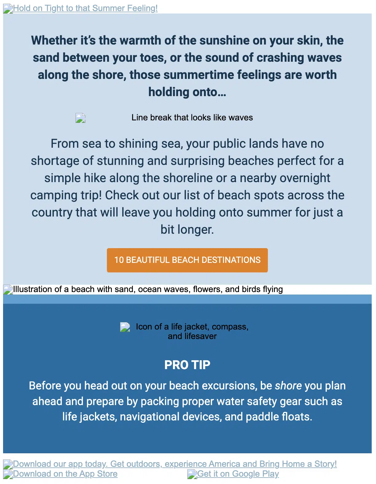
Recreation.gov uses ALT text to describe each image in their emails. This ensures everyone can enjoy their emails, enhancing overall accessibility.
Plain text styling: Determine if your email service provider automatically generates the plain-text version of your HTML emails.
If so, specify any necessary styling or content adjustments. If not, provide guidelines for manually creating the plain-text version, including styling instructions for consistency.
Images
Image type: Determine when image-only emails are appropriate and recommend preferred image types based on content and subject matter.
Provide guidelines for animated GIFs, including file size restrictions and strategies for dealing with lack of support in most versions of Outlook (except Outlook for Office 365 users).
Image size: Specify image size dimensions for standard elements like featured images, secondary images, and thumbnails within product grids.
Image resolution: When using retina images for emails, save them at double the intended size and specify the intended dimensions in the <img> tag.
For example, for an image meant to be 200×200 pixels, save it at 400×400 pixels.
However, mention when to sacrifice some image sharpness for faster load times.
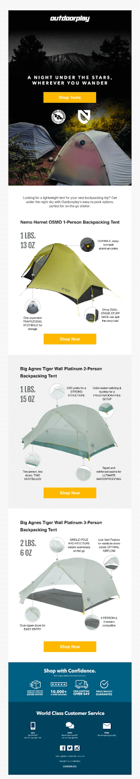
Email images grab attention and reinforce your branding, but they need to be used wisely. Here's an example from Outdoorplay: the email features a simple yet visually appealing design.
Logo optimization: Outline guidelines for adjusting your logo to optimize it for email. It's recommended to code your logo into emails as a partial, ensuring consistency across all messages and enabling quick updates across your email campaigns.
Call-to-Actions
CTA language: Define standard CTA language and any variations based on device type or subscriber segment.
Bulletproof buttons: Your email style guide should provide code snippets for creating bulletproof buttons in various styles for your emails.
CTA organization: Clarify how to distinguish primary CTAs from secondary and tertiary ones to maintain a clear hierarchy.
This Dunkin Donuts email is a perfect example of a compelling hierarchy and a clear CTA.

Color schemes
Color psychology reveals how colors impact consumer emotions and behavior. Incorporating your brand's color scheme into emails enhances brand recognition and fosters an emotional bond with subscribers.
Consistency is key—use the same colors from your website or logo across all brand emails to reinforce your identity effectively.
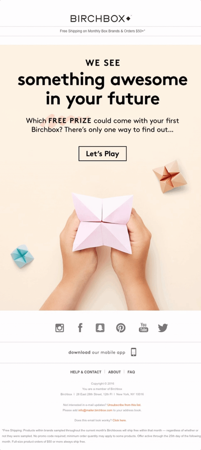
Birchbox uses its brand colors in the email, effectively reinforcing its brand identity.
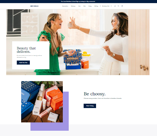
They skillfully incorporate their brand colors in the email below.
Frequently used content elements
To enhance the efficiency of your email creation process, ensure your style guide includes frequently used content elements. This includes:
- Email headers
- Email footers (including unsubscribe links)
- Navigation bars
- Guarantees
- Disclaimers
- Taglines
- Product descriptions
- Value propositions, bullet points, etc.
- Promotions for mobile apps and social media
- Icons
Having these elements readily available streamlines the workflow, expediting creation, reviews, and approvals.
Actionable tips for creating and implementing your style guide
Here are a few actionable tips to help you create and implement your very own email style guide.
Assess your resources: Evaluate if you lack the resources to create an email design system internally.
Engage expertise: Consider outsourcing to email design specialists who can tailor a system to your brand guidelines.
ROI (Return on Investment) calculation: Calculate your current ROI using metrics like list size, click-through rate, conversion rate, and average sale price.
Email marketing ROI analysis: Analyze where an email design system could enhance your ROI using the provided calculator.
Implement no-code workflow (like Chamaileon): Integrate the email design system into your workflow for seamless campaign setup without coding.
Optimize with Chamaileon: Utilize the Chamaileon platform to further customize and extend the design system, maximizing its impact on your campaigns.
Optional integration with Chamaileon
Consider integrating with Chamaileon for further flexibility. Our email designers create a custom-tailored email design system based on your brand guidelines. This includes pre-designed components, email modules, and example templates.
With access to the Chamaileon platform, you can easily edit and extend the design system, optimizing your email campaigns at a fraction of the cost.
Conclusion
In summary, having a solid email style guide is crucial for maintaining consistent and impactful email designs. By integrating brand guidelines, tackling challenges, and following best practices, you'll boost brand recognition, enhance user experience, and increase conversions.
With a well-crafted email style guide, you'll streamline your workflow, ensure brand consistency, and take your email marketing to the next level of success.
What’s better than a design guide? A design system.
Frequently asked questions about email design style guide
What are some good examples of email design style guides?
Examples of excellent email design style guides include those from Shopify, Litmus, Campaign Monitor, Apple, and Salesforce.
Do I need a separate style guide for mobile email design?
Yes, having a style guide for mobile email design is beneficial. It's essential to consolidate all your style guides in one place, ensuring easy access for your designers, marketing team, and developers. This centralization streamlines collaboration and maintains consistency across all platforms.
Does Chamaileon.io offer any templates for email design style guides?
Yes, Chamaileon.io provides templates for email design style guides. These templates help you create a consistent and professional appearance for your email campaigns, ensuring your brand's visual and tonal elements are uniform across all communications.
How can Chamaileon.io help me collaborate on my email design style guide with my team?
Chamaileon.io makes collaborating on email design style guides easy with its multi-user/team environment. You can quickly train your team to use the user-friendly platform, allowing everyone to contribute to creating and maintaining your email style guides.
This streamlined process ensures consistent and high-quality email designs while distributing the workload more evenly among team members.
What are some best practices for accessibility when designing emails?
Best practices for accessible email design include using descriptive ALT text for images, ensuring high contrast between text and background, choosing readable fonts, providing a plain-text version, and making interactive elements easy to navigate with clear labels and keyboard accessibility. Also, use semantic HTML and avoid using color alone to convey information.