10 Best Fonts for Email Design in 2024

Today, the digital landscape is much more competitive and digital marketers are constantly striving to create better strategies for a greater brand impression. This greater brand presence can be built by providing the right messaging through different mediums including visually appealing and engaging email campaigns.
But have you ever considered the impact of your font choices in these emails? Believe it or not, the fonts you select can significantly influence your email's effectiveness.
Selection of the best fonts for emails goes beyond aesthetics. It's about ensuring your message is clear, readable, and resonates with your target audience. However, many brands have custom fonts with different font sizes and styles in their design guidelines that can be difficult, if not impossible, to implement directly within email service providers (ESPs) or marketing platforms. It's crucial to understand the impact of various font sizes and styles on the overall design and effectiveness of your emails.
The good news? Don't despair! While using your exact brand font might require a workaround, there are plenty of fantastic alternatives that can maintain brand consistency and enhance your email design. This blog post will introduce you to the world of email fonts, equipping you with the knowledge and resources to make informed decisions while creating the next email campaign.
Why Do Fonts Matter?
Fonts play a crucial role in establishing brand identity and shaping the overall user experience within your emails. They act as visual representatives of your brand voice, conveying professionalism, trustworthiness, or even a sense of fun, depending on your chosen style.
However, the challenge for many IT marketers lies in the limitations of ESPs. These platforms often restrict the use of custom fonts due to compatibility issues. But keep your hopes high, as there's a vast selection of web-safe fonts that render consistently across different email clients and devices.
Key takeaway: While you might not be able to use your exact brand font directly, there are numerous web-safe alternatives that can closely resemble your brand's style and ensure optimal readability across the board.
Email Font Families
Before diving into specific fonts, let's explore the concept of font families. Just like biological families, fonts have groupings that share similar characteristics. These groupings are called font families. For instance, Arial and Arial Bold are both part of the Arial font family.
Understanding font families is important because you'll often choose a font family and use different weights (like regular, bold, or italic) within that family to create visual hierarchy and emphasis within your email.
What is an Email Font Category?
Choosing the right fonts can make a world of difference, but with so many choices out there, it's easy to feel overwhelmed. Let's first simplify things. Email fonts can be broadly categorized into two main groups: web-safe fonts and web fonts.
What are web-safe fonts?
These are fonts that are pre-installed on most computers and mobile devices. This ensures consistent rendering across different email clients, making them a reliable choice for emails.
What are web fonts?
These are fonts that aren't pre-installed and need to be downloaded by the recipient's device when they open your email. While web fonts offer a wider variety of styles, there's a chance they might not display correctly if the recipient's device doesn't have the font installed.
10 Best Fonts to Use in Emails
Understanding the fundamentals is a right way to move ahead in order to build a successful marketing campaign, let's explore 10 fantastic web-safe fonts that can elevate your email design in 2024 and best font for emails according to different email requirements:
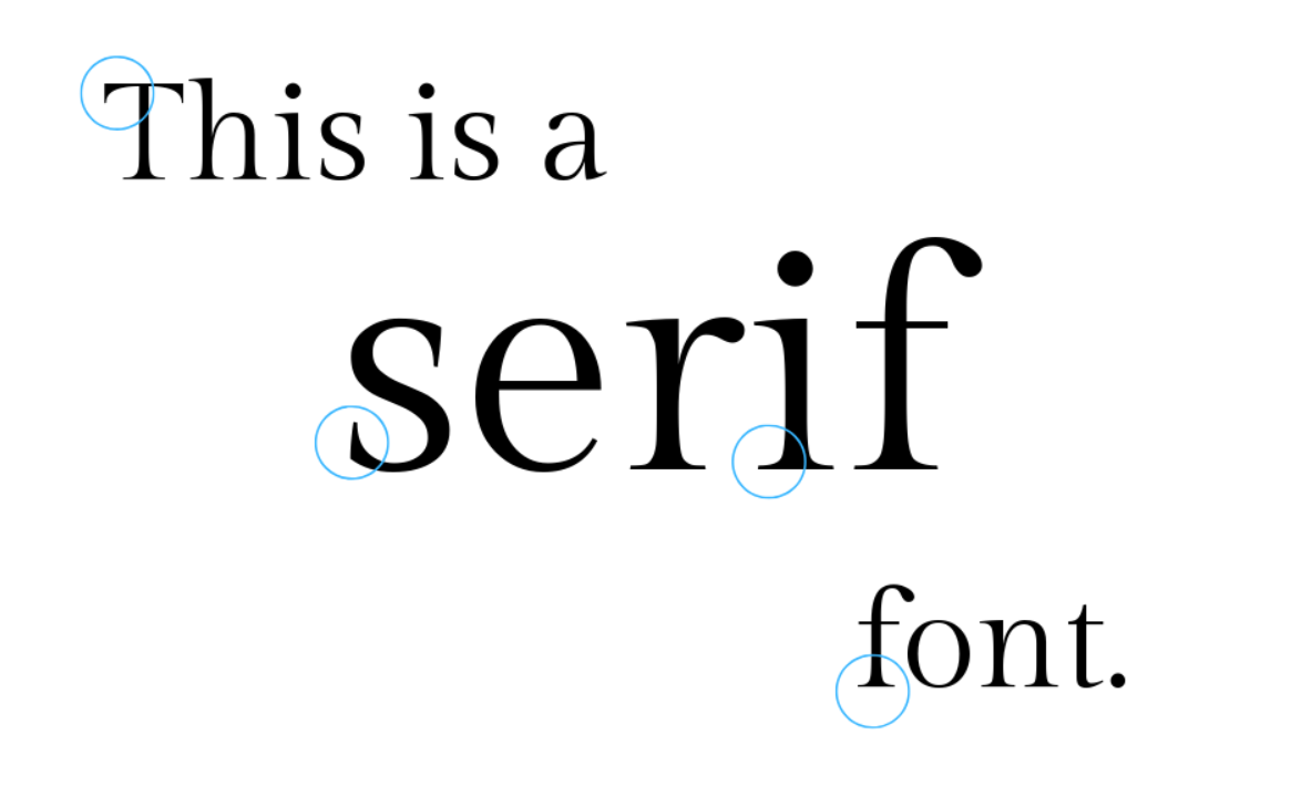
Serif Fonts:
Serif fonts are those that have small decorative strokes at the ends of their characters. They are often considered classic and elegant choices, ideal for conveying a sense of tradition or authority.
- Open Sans: A highly versatile and readable sans-serif font, Open Sans is a popular choice for emails. It offers a clean and professional look, making it suitable for a wide range of email marketing campaigns.
- Georgia: A classic serif font with good readability, Georgia is a great option for emails with a touch of formality.
- Times New Roman: This timeless serif font is instantly recognizable and conveys a sense of tradition. However, due to its over familiarity, consider using it subtly to avoid a dated look.
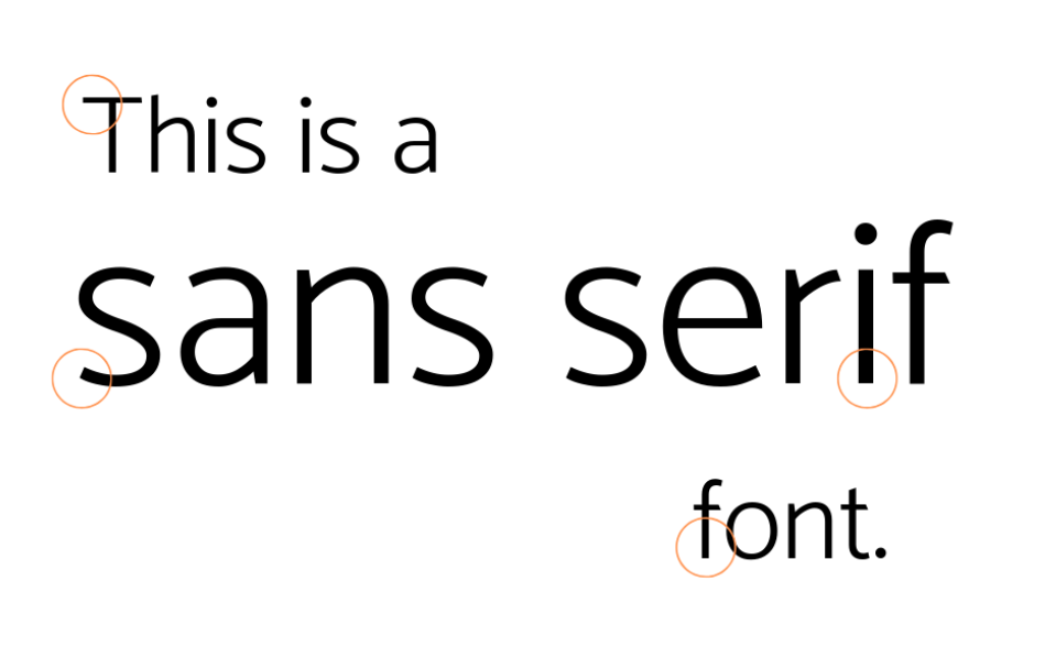
Sans-serif Fonts:
Sans-serif fonts lack the decorative strokes of serif fonts, resulting in a cleaner and more modern aesthetic. They are generally considered easier to read on screens and are perfect for conveying a contemporary feel.
4. Verdana: A widely used sans-serif font known for its excellent readability, Verdana is a dependable choice for email body text.
5. Helvetica/Geneva: These two fonts are very similar and offer a clean, professional look. Helvetica is technically not a web-safe font, but most email clients render it similarly to Geneva, a true web-safe alternative. Both are excellent options for emails requiring a modern and clear aesthetic.
6. Arial: Another highly recognizable sans-serif font, Arial is a safe and reliable choice for email body text and is often considered as the best font for emails. It offers good readability and complements a variety of design style
7. Tahoma: A clean and professional sans-serif font, Tahoma is a popular choice for email design. It offers good readability on both screens and print, making it a versatile option for emails.
Other Font Categories:
8. Fantasy Fonts: While generally not recommended for email body text due to readability concerns, fantasy fonts can be used sparingly for headlines or specific design elements to add a touch of personality or whimsy, depending on your brand and campaign goals.

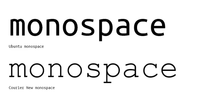
9. Monospaced Fonts: These fonts have a fixed character width, making them ideal for displaying code snippets or data tables within your emails. A popular example is Courier New.
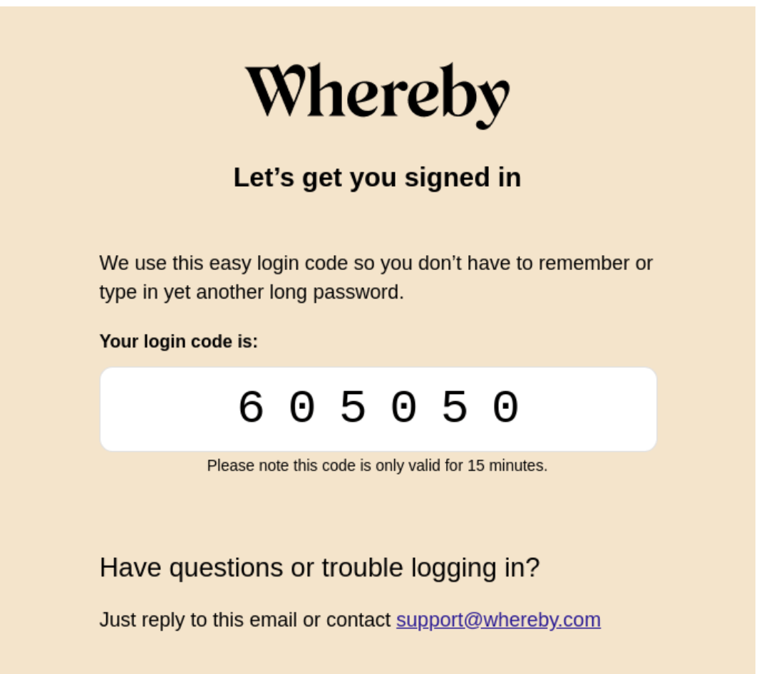
This is how Whereby uses a stylized monospace font for the two-factor login code their system sends in a transactional email:
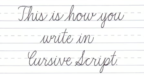
10. Cursive Fonts: Similar to fantasy fonts, cursive fonts can be challenging to read on screens and should be used cautiously, if at all, in email body text. However, they might be suitable for signatures or short decorative elements.
3 Worst Fonts for Email Design
While many fonts can work well in emails, some are best avoided due to readability issues or overuse:
- Comic Sans MS: This playful font might seem like a fun choice, but its informality can detract from the professionalism of your marketing emails.
- Curlz: The loopy nature of this font makes it difficult to read, especially on smaller screens.
- Trajan: While visually striking, Trajan's bold, decorative style can overwhelm readers and isn't ideal for email body text.
Best Practices to Use Email Fonts
Now that you have a strong foundation in email fonts and you are able to differentiate between worst and best fonts for email, let's explore some best practices to optimize their use:
Font Size
For optimal readability, aim for a font size between 14px and 16px for body text and slightly larger sizes (16px-18px) for headings.
Line Spacing
Maintain adequate line spacing (around 1.5 times the font size) to improve readability and prevent your email content from appearing cramped.
Line Height
Line height refers to the vertical space between lines of text. Ensuring proper line height complements good line spacing for optimal reading comfort.
Text Alignment
Left-aligned text is generally the most readable format for email body content. Center alignment can be used for headlines or short call-to-action buttons.
Email Signature Font
Choose a professional and readable font for your email signature. Sans-serif fonts like Arial or Verdana are popular choices.
Font Pairings
Experiment with combining two web-safe fonts for a more visually interesting design. A good rule of thumb is to pair a serif font for headings with a sans-serif font for body text to create a clear hierarchy.
Font Colors
Maintain sufficient contrast between your font color and background color to ensure readability. Black or dark gray text on a white background is a safe and reliable combination.
Links Formatting
Clearly differentiate your email links from body text. Underline them and consider using a contrasting color to make them easily identifiable.
Call to Action Buttons
Use a clear and concise font for your call-to-action (CTA) buttons. Ensure the font size is large enough to be noticeable and complements the overall button design.
How Can You Use Web Fonts in Your Emails?
While web-safe fonts are the most reliable choice, you might still be curious about using web fonts for a touch of extra design flair. Here are a few options to consider:
ESP Support
Some ESPs offer limited support for web fonts, allowing you to embed the font code directly into your email. However, this functionality may not be available on all plans or might come with limitations.
Email Design Services
Certain email design services can help you embed web fonts into your emails using various techniques. These services often involve additional costs.
Fallback Fonts
If you choose to use a web font, always include a fallback web-safe font in your code. This ensures that even if the recipient's device doesn't have the web font installed, your email content will still display using the fallback option.
How to Use Web Fonts in Chamaileon?
If you're a Chamaileon user, you can easily create stunning email designs without putting much effort. This platform makes it easy for you to explore adding custom fonts through the platform. Here's a simplified guide:
- Locate the menu icon in the top left corner of your Chamaileon workspace.
- Within the menu, find and select the "Custom Fonts" option.
- Select your desired font source, such as Google Fonts or another website.
- If you’re selecting Google Fonts, browse it’s font library and choose the font that aligns with your design goals.
- On the chosen font's page, locate the "Get embed code" option and copy the URL link.
- Within the "Custom Fonts" section, click the "Add Font URL" button.
- Enter the font name, paste the copied URL link, and save the information.
- You can now combine your custom font with other fonts within Chamaileon to create unique font stacks for your email design.
How to Choose the Best Fonts for Your Email?
Choosing the best font for email depends on several factors:
Brand Identity
Consider fonts that align with your brand's overall aesthetic and voice. For instance, a tech startup might choose a clean and modern sans-serif font, while a law firm might opt for a more traditional serif font.
Target Audience
Think about your ideal recipient and the kind of tone you want to convey. Sans-serif fonts tend to be more casual and contemporary, while serif fonts can appear more formal and traditional.
Email Purpose
Is your email a promotional newsletter, a transactional update, or a personalized message? The purpose of your email can influence your font selection. For example, a welcome email might benefit from a warm and inviting font, while a technical update might prioritize clarity and readability.
Readability
Above all else, prioritize fonts that are clear and easy to read on all devices, especially mobile devices. Avoid overly decorative or complex fonts that might strain readers' eyes.
Conclusion
Fonts play a critical role in shaping the user experience within your IT marketing emails. By understanding the different font types, best practices, and available options, you can make informed decisions to enhance the visual appeal and readability of your email campaigns.
Remember, the ideal fonts are clear, professional, and align with your brand identity. Don't be afraid to experiment and find the perfect font combination to beat the email design trends in 2024 and capture the attention of your target audience.
Ready to take your email design to the next level?
Download The Handiest Guide for Email Design Systems and discover valuable resources to create impactful email campaigns.
Frequently Asked Questions about Best Fonts for Emails
1. What is the best font for professional emails?
There's no single "best" font for emails, but some popular choices for professional emails include Arial, Verdana, Georgia, and Open Sans. These fonts are clear, readable, and convey a sense of professionalism.
2. What font size is best for emails?
For optimal readability, aim for a font size between 14px and 16px for body text and slightly larger sizes (16px-18px) for headings.
3. Which font is used in Gmail?
Gmail uses Arial (from Sans-Serif font family) as its default font for both body text and headings.
4. What is the No 1 style font?
There's no universally agreed-upon "No. 1" style font. The best font choice depends on the specific context, brand identity, and target audience.