10 Best Email Icons to Design Compelling Emails
Icons in email design act as visual cues that enhance comprehension, break up text-heavy content, and ultimately guide readers towards your desired call to action.

In today’s digital landscape, where the inboxes are overflowing and competition is fierce, platform and CRM managers face a unique challenge. They need to create email sequences that nurture leads, guide them through onboarding, and build long-term relationships, all while maintaining engagement with regular emails including newsletter and product updates.
While crafting compelling content is crucial, incorporating strategic visual elements like icons for email design can significantly improve your email design elements and components and their effectiveness.
Incorporating high-quality icons into your emails is a strategic decision. Icons in email design act as visual cues that enhance comprehension, break up text-heavy content, and ultimately guide readers towards your desired call to action.
This blog post dives deep into the explanation and usability of icons for email design and equips you with 10 exceptional resources to find the perfect icons in order to give a boost to your email marketing campaigns.
What are Email Icons?
In an email design system, there are icons as "variables", the smallest building bricks, defined and used through emails and designs. These small graphics are embedded within an email to convey specific meaning or actions that need to be taken. These icons are versatile and come in various styles, from flat and minimalist to line art and illustrative.
Benefits of Icons in Emails
Don't underestimate the power of a well-placed icon!
For example, my two favourites are:


These tiny graphics offer a surprising array of benefits for your marketing email campaigns:
Visual Appeal
In a world bombarded by text, email icons offer a welcome splash of color and visual interest. They create a more dynamic layout and make your emails easier to scan and digest. Eye-catching visuals can also pique reader curiosity and encourage them to delve deeper into your content.
Improved Communication
Icons are a universal language that transcends cultural and geographical barriers. A well-chosen icon can instantly convey a message or concept, eliminating the need for lengthy explanations. This is particularly beneficial for IT-related topics that may involve technical jargon. For example, in marketing emails focused on link building campaigns, icons can highlight resources, outreach opportunities, or key CTAs in a way that feels more approachable and less overwhelming than plain text.
Increased Click-Through Rates
Strategically placed icons can act as directional signals, guiding readers towards your desired call to action (CTA). For instance, an icon of an arrow pointing towards a button can subconsciously nudge readers to click and learn more.
Improved Brand Recognition
Strategic use of icons that align with your brand colors, style, and overall visual identity can strengthen brand recognition within your emails. Over time, recipients will begin to associate specific icons with your brand, leading to faster message recognition and trust building.
Enhanced Scannability
In today's fast-paced world, email subscribers often skim content rather than reading it word-for-word. Icons break up text-heavy content and give a breath to the copy that allows readers to quickly grasp the main points of your email. This can significantly improve scannability and ensure your key messages are not overlooked.
A/B Testing for Optimization
One important aspect IT marketers miss understanding is the power of A/B testing which is crucial to determine which email icons resonate best with your audience. Test different icon styles, placements, and combinations within your email campaigns to identify what drives the highest engagement and click-through rates.
Accessibility
Icons can enhance accessibility for readers with visual impairments or those who use screen readers in several ways:
- Improved Screen Reader Compatibility: When each icon has descriptive alt text associated with it, screen readers can vocalize the text description for visually impaired users. This ensures they understand the meaning and function of the icon alongside the surrounding text content.
- Cognitive Assistive Technology Support: For users with cognitive disabilities who may benefit from assistive technologies, icons can act as visual signals that simplify complex information or break down lengthy text passages. Clear and recognizable icons can improve comprehension and user experience for these individuals.
- Reduced Reliance on Color Perception: Effective email icon design often minimizes dependency on color alone to convey meaning. This benefits users with color blindness or those viewing emails in low-contrast settings. By combining clear visual form with descriptive alt text, icons become universally understandable.
10 Best Email Icon Resources
Now that you understand the power of icons for email design, let's explore some of the best resources to find the perfect ones for your marketing campaigns in the IT industry:
1. Icon Finder
Icon Finder contains a vast library of free and premium icons, catering to a wide range of styles and themes. This platform offers a user-friendly search function with advanced filters to help you narrow down your choices. A free account grants access to a limited number of icons, while premium plans offer extended downloads and additional features.

2. The Noun Project
The Noun Project is a unique resource dedicated to open-source icons. This non-profit platform offers a vast collection of beautifully designed, free-to-use icons covering a broad spectrum of topics. The easy-to-navigate interface and clear licensing information make The Noun Project a valuable asset for IT marketers.

3. Roundicons
As the name suggests, Roundicons specializes in – you guessed it – round icons! This platform offers a curated selection of high-quality, free-to-use circular icons in various styles and colors. Roundicons is an excellent choice for email campaigns that favor a clean, minimalist aesthetic.

4. Icons8
Icons8 is a popular design resource offering a vast library of not only icons but also illustrations, music, and photos. Their email icon collection is impressive, featuring a wide range of styles from flat and outlined to filled and 3D. Icons8 provides both free and premium plans, with the free plan offering access to a limited number of downloads per month.

5. Iconmonstr
Iconmonstr provides a comprehensive collection of free and premium icons, neatly categorized for easy browsing. The platform offers a generous free plan with access to thousands of icons, while premium plans unlock additional features like unlimited downloads and the ability to edit icons.
6. Dryicons
Dryicons caters to those seeking high-quality, unique icons with a touch of personality. This platform offers a collection of free and premium icons in various styles, including flat, outlined, and hand-drawn. Dryicons is an excellent choice for IT marketing campaigns that want to stand out from the crowd with a touch of creative flair.
7. Flaticon
Flaticon has one of the largest collections of free icons available online, with millions of icons covering virtually any topic imaginable. Their email icon selection is equally impressive, offering a diverse range of styles and colors. A free account grants access to a limited number of downloads per day, while premium plans offer extended downloads and additional features.

8. Iconshock
Iconshock offers a comprehensive collection of premium icons, illustrations, and vector graphics. Their email icon selection is diverse, featuring a variety of styles and themes relevant to IT marketing campaigns. While Iconshock doesn't have a free plan, they do offer affordable individual icon purchases and subscription plans for frequent users.

9. Material Design Icons
Developed by Google, Material Design Icons adhere to Google's Material Design principles, known for its clean, user-friendly aesthetic. This collection of free, open-source icons offers a consistent and polished look ideal for emails with a modern, minimalist design.
10. IconScout
IconScout is a marketplace featuring a diverse collection of premium icons created by independent designers. Their email icon selection offers a unique and creative twist, perfect for IT marketing campaigns aiming to stand out with a touch of originality. IconScout requires individual icon purchases or subscription plans for extended use.
Conclusion
By using well-chosen icons into your email marketing campaigns, you can significantly enhance their visual appeal, improve communication clarity, and ultimately drive engagement and click-through rates. The resources listed above provide a treasure trove of high-quality email icons to elevate your email design and ensure your IT messages resonate with your target audience.
Ready to use the impactful icons for email in your next campaign?
Frequently Asked Questions about Icons for Emails Design
1. How can I make my email attractive?
There are several ways to make your emails more attractive:
- Incorporate high-quality visuals: This includes email icons, relevant images, and even short videos to give the required breath to the copy and keep the reader engaged throughout.
- Maintain a clean and consistent design: Use clear fonts, consistent color palettes, and ample white space for better readability.
- Personalize your emails: Use segmentation and dynamic content to send your emails to specific audience segments for a more relevant and impactful experience.
- Craft compelling subject lines: A catchy subject line plays an important role in order to grab attention and persuade recipients to open your email.
For a deeper dive into email design best practices, check out our resources on Email Design Components and User Experience in Email Design.
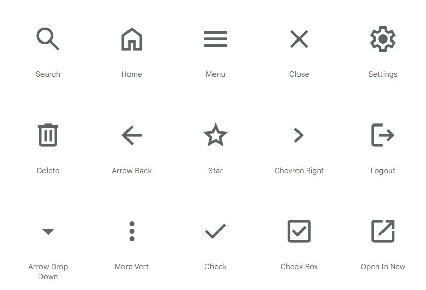
2.What do the icons mean on email?
The meaning of an email icon depends on the specific icon itself. However, well-designed icons are generally easy to understand based on their visual representation. For instance, an envelope icon typically signifies a new message, while a gear icon might represent settings. If you're unsure about an icon's meaning, it's always best to include descriptive alt text to ensure clarity for all readers.
3. How do you make an eye-catching email?
Here are some tips for creating eye-catching emails:
- Use contrasting colors: Emphasize important elements including CTA with contrasting colors to make them stand out. Think of a red button highlighted surrounded with some contrast in the background.
- Incorporate animations or GIFs (use sparingly): Subtle animations or GIFs can add visual interest and movement, but avoid overdoing it to maintain a professional look.
- Personalize your emails with user-generated content: Including user reviews, testimonials, or customer photos can add authenticity. It automatically grabs attention and resonates with readers more than traditional marketing messages.
4. What symbols are acceptable in email?
While most common symbols are generally acceptable in emails, it's important to use them judiciously. Avoid using overly complex symbols or those with ambiguous meanings. Always prioritize clarity and ensure your email message is readily understood by your target audience.